17/32 – Cincinnati Vultures
Fear the Reapers
We're kicking off the second half of this project with team number 17, the Cincinnati Vultures of the Great Lakes Division in the East Conference.
The Vultures have been the UFL's Cinderella for the past few seasons through a series of unpredictable events. Season 24 lifted an 8-8 division-winning Cincinnati team all the way to the Championship game before falling to Los Angeles. The following season, the Vultures would secure the worst record in the league but would miss out on the #1 overall pick, cashing it in on a star receiver the offseason prior. With a new quarterback at the helm for Season 27, the Vultures would reclaim the division title and make another deep playoff run.


Visual Direction
This franchise is one of a few with no real tangible ties between the location and the nickname. While turkey vultures are widespread across North America, there isn't significant instance that makes the vultures in Cincinnati noteworthy.
Despite this, "Vultures" makes for a killer nickname for a football team. Being scavengers that feed off of the dead, vultures are the ultimate opportunists of the animal kingdom. Life imitates art in this case, as the Cincinnati Vultures have seen themselves on the positive side of unusual circumstances.
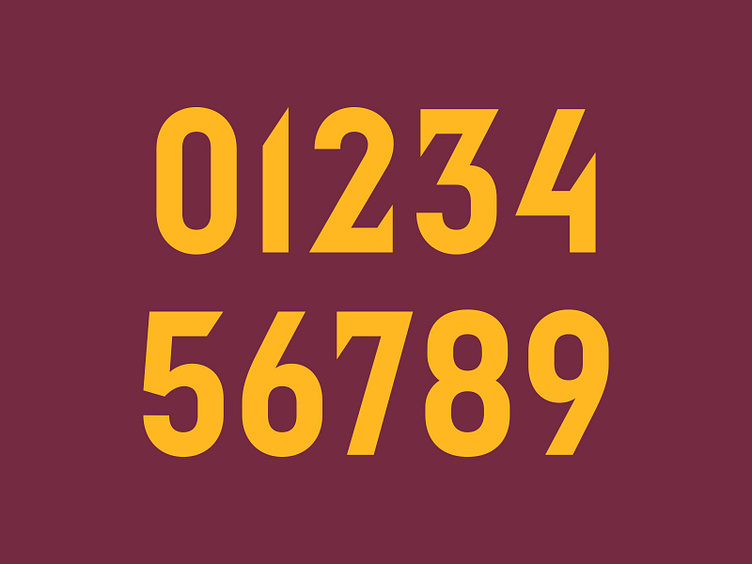
Execution
The primary logo for the Vultures is a simplified turkey vulture head in a dynamic oval shape. On lighter backgrounds, the graphic has a wine-colored outline to maintain the color balance across all environments.
Cincinnati's secondary logo illustrates the turkey vulture in full-body. The head is released from the oval container and paired with a perched body with wings spread wide. The vulture's tailfeathers double as a football with the talons making up the laces of the ball.
A "CV" monogram lands in the tertiary spot. The top arch of the "C" imitates the head and the "V" simulates the shoulders in this vulture abstraction.
The typographic style for the Vultures' wordmarks can be classified as a condensed sans serif with several modifications. Each letterform incorporates a sheared edge of some kind – "I's" and "V's" poke through the cap height and baseline respectively and the "A's" and "R's" have chopped up counters. The "C's" and "S's" have sheared terminals that help convey an aggressive tone. This style is also carried through to the jersey number set.
Making the Cut
The Cincinnati Vultures now have a renewed visual identity and graphic suite that aims to build upon an unusual storyline that is unique to the franchise.
Football Helmet Mockup by SportsTemplates
____________________