Mesa Visual Identity
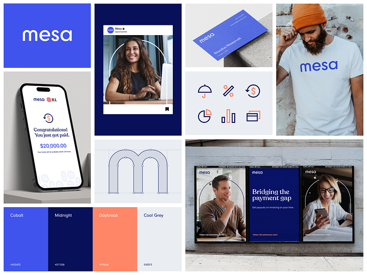
Throwback to Mesa's visual identity we landed on during a brand sprint. We leaned into the idea of a bridge to focal point as Mesa platform allows users to accelerate payments on invoices closing payment gaps. The 'm' in Mesa acts as a visual representation of a bridge which we used to carry out as part of the brand's visual language.
✌️ Have a project you'd like to chat about? Hit us up at heyo.is/excited-to-chat