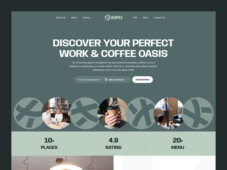
Kipo - Coworking Space Landing Page
Overview
Kipo - Coworking Space and Coffee sought to create an inviting and functional landing page to attract freelancers, entrepreneurs, and remote workers. The goal was to design a user interface (UI) that seamlessly blended aesthetics with usability, reflecting the vibrant community and high-quality services offered by Kipo.
Problems
Kipo did not have a dedicated landing page, which made it challenging to convey its unique offerings and engage potential members. Without a centralized online presence, potential customers struggled to find detailed information about Kipo's services, amenities, and community, leading to missed opportunities for growth and connection.
Objectives
The primary objective was to design a landing page to improve user engagement and conversion rates. Key goals included creating an intuitive navigation system, showcasing Kipo's unique offerings, and integrating strong calls to action. Additionally, the redesign aimed to enhance the visual appeal of the page to reflect the vibrant and welcoming atmosphere of Kipo.
Objectives
The primary objective was to design a landing page to improve user engagement and conversion rates. Key goals included creating an intuitive navigation system, showcasing Kipo's unique offerings, and integrating strong calls to action. Additionally, the design aimed to enhance the visual appeal of the page to reflect the vibrant and welcoming atmosphere of Kipo.


