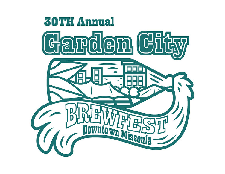
Garden City BrewFest Logo
I am really proud of this logo design I did a couple months ago for Missoula Downtown Association for the 30th Annual Garden City BrewFest. The concept behind this design was the energy of downtown Missoula in a bottle (like a ship is a bottle) bursting open into a river (the Clark Fork).
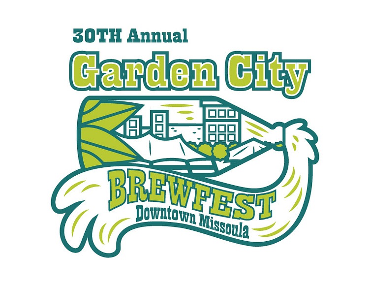
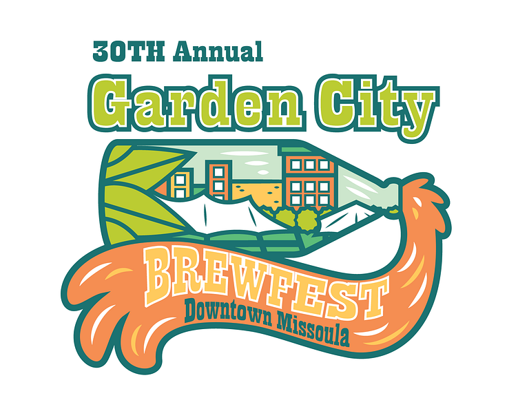
I initially came up with three concepts for the logo design and this was the one that came out on top. The idea behind this particular design was to make something that was fun but also easily recognizable (Caras Park Pavilion and the Wilma) without adding too many details in. I chose a very vibrant spring/ summer color palette for this to basically make the statement that winter was finally (really) over and that everything was starting to come alive for the year turned all muted colors and greys into full bloom of colors!