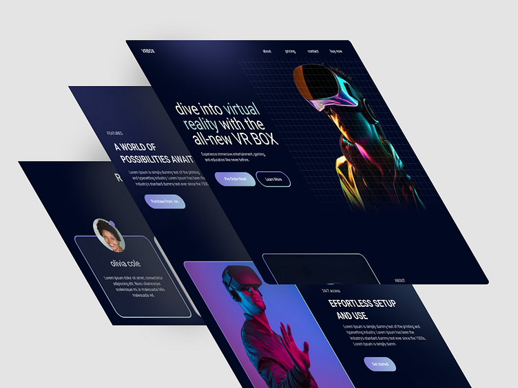
Introducing the All-New VR Box Landing Page Design
Hey Dribble community! 👋
I’m excited to share my latest project – a landing page design for VR Box, a cutting-edge virtual reality device. This design focuses on creating an immersive and engaging user experience that showcases the innovative features of the VR Box.
Key Features:
Bold & Futuristic Design: The aesthetic is sleek and modern, reflecting the advanced technology of the VR Box.
Interactive Elements: Hover effects and animated transitions to keep users engaged.
Responsive Layout: Optimized for both desktop and mobile devices, ensuring a seamless experience across all platforms.
Clear Call-to-Actions: Strategically placed CTAs to guide users towards exploring more about the VR Box and making a purchase.
Detailed Product Showcase: High-quality images and detailed descriptions to highlight the key features and benefits of the VR Box.
Design Tools:
Figma: The entire design process was carried out using Figma, taking advantage of its collaborative features and prototyping capabilities.
Inspirations:
The inspiration behind this design was to create an interface that feels as immersive as the VR Box itself. I aimed to blend futuristic elements with a user-friendly layout to provide a glimpse into the potential of virtual reality.
Feedback:
I’d love to hear your thoughts and feedback! Feel free to leave a comment or press that ❤️ button if you like the design.

