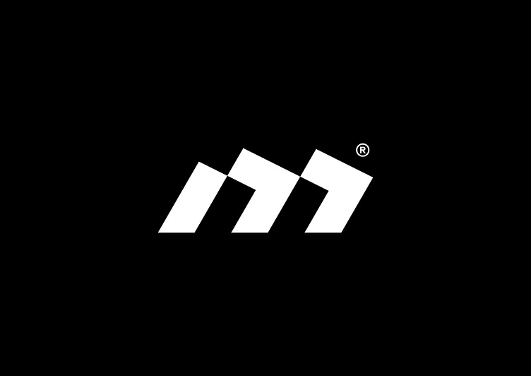
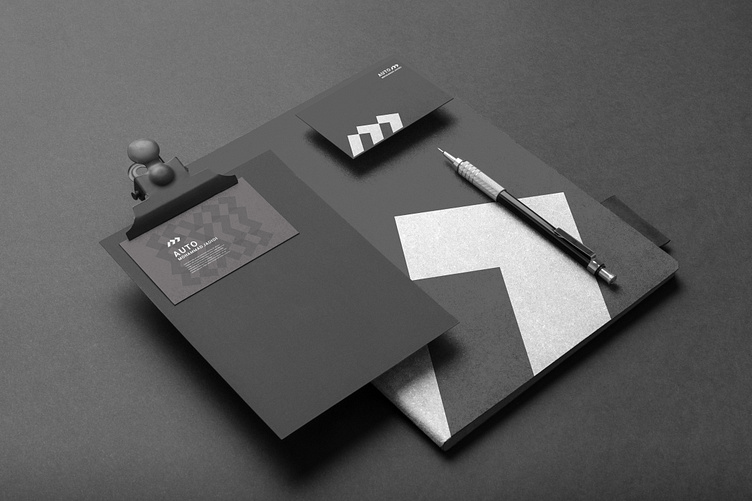
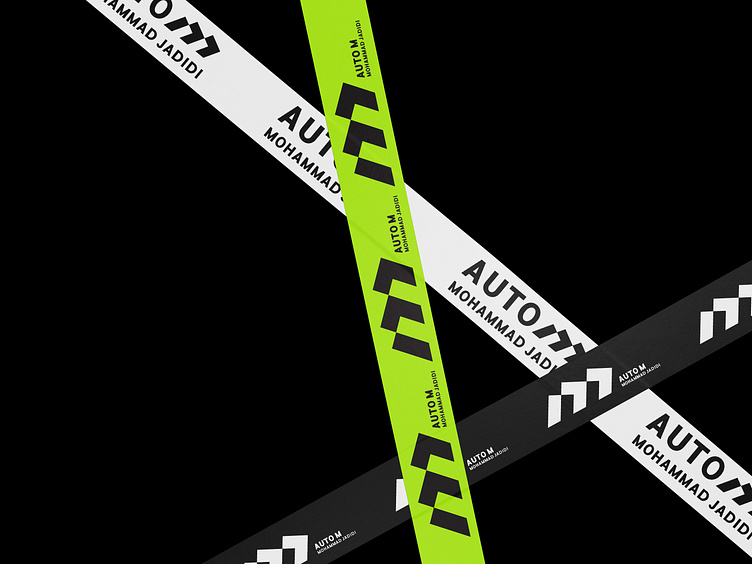
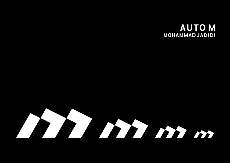
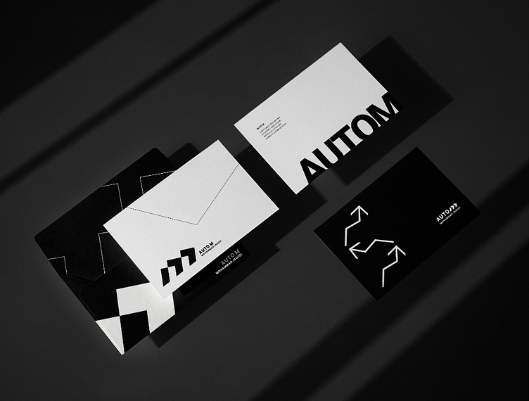
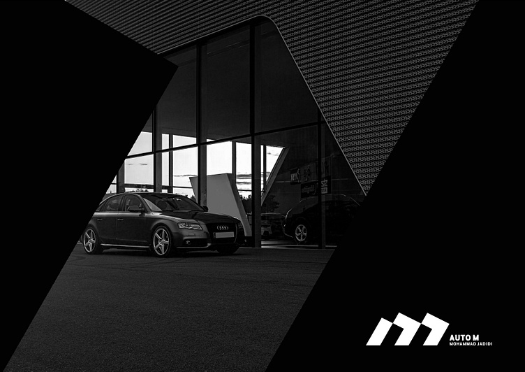
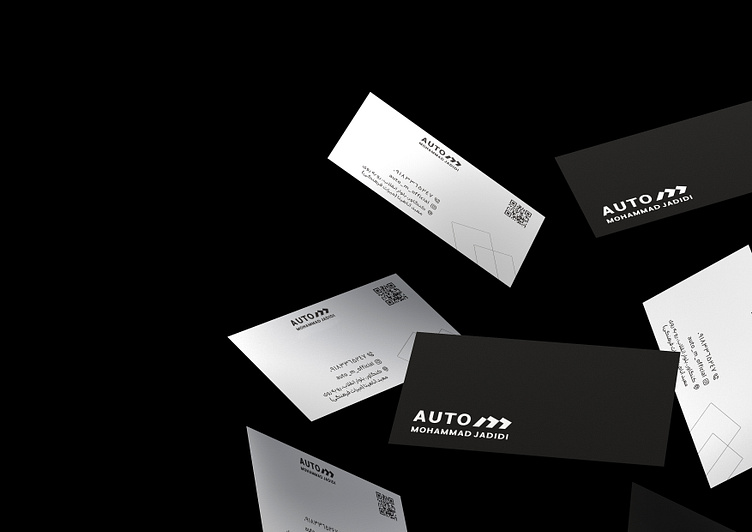
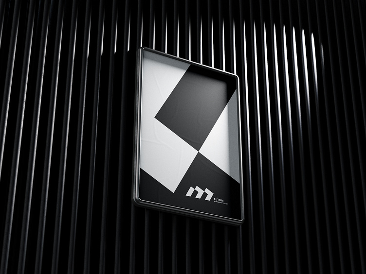
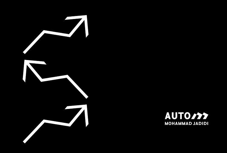
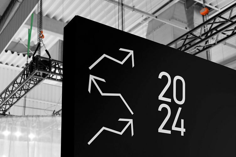
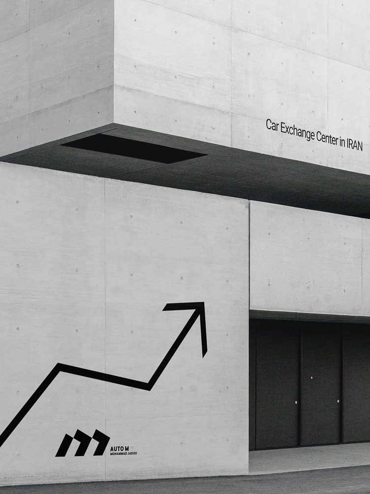
AUTO M Brand Identity Design


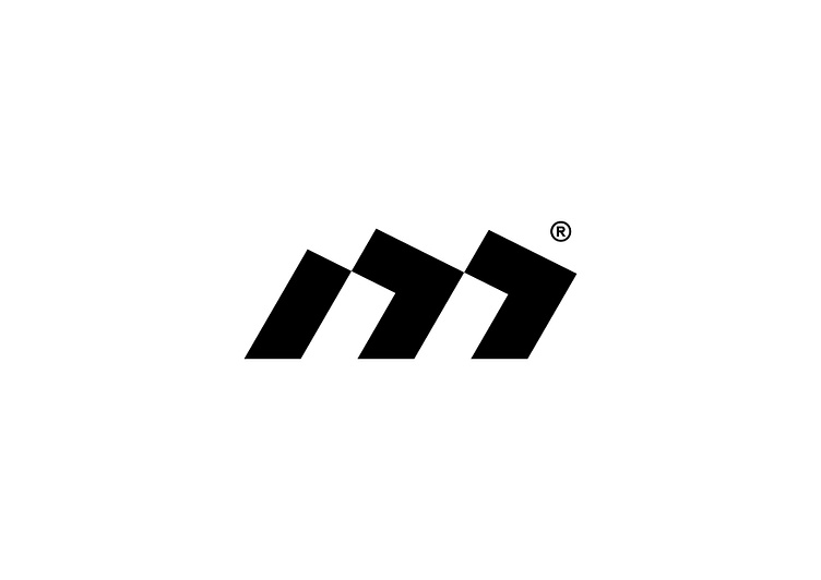
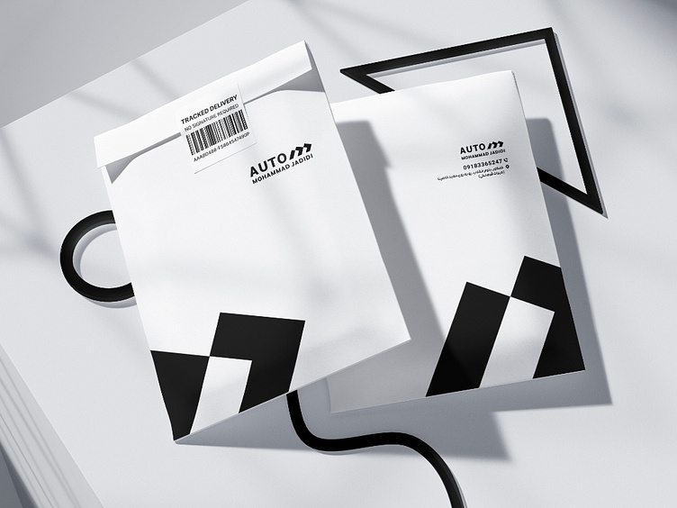
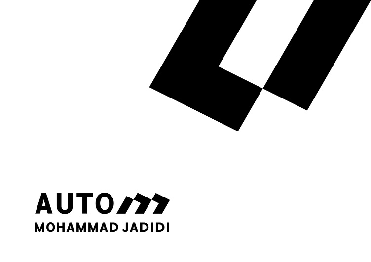
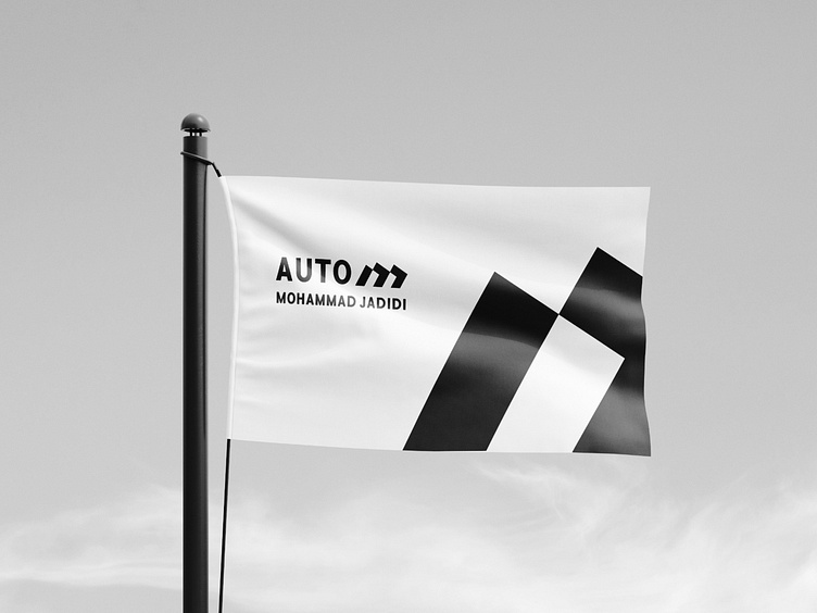
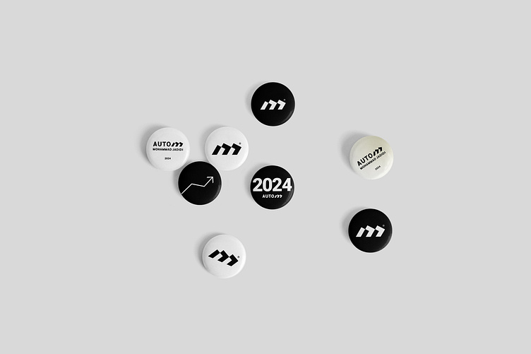
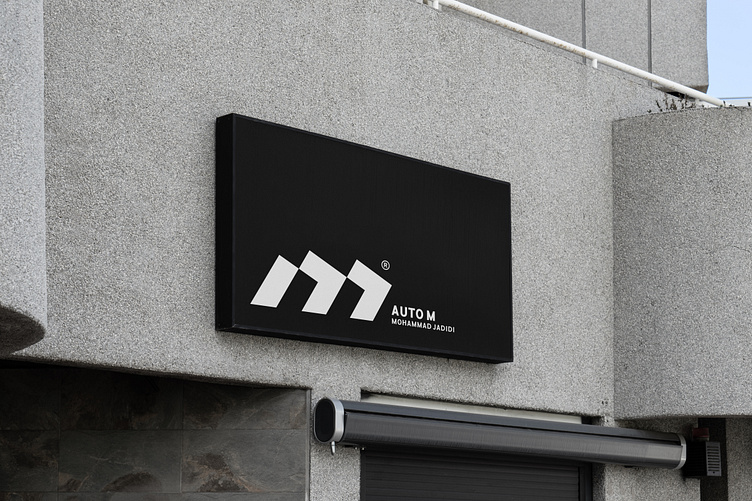
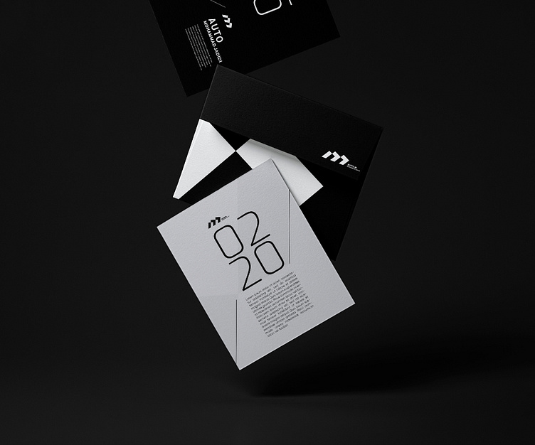
The logo design of "Auto M", the car sales and exchange center in Iran, was inspired by the concepts of movement, speed and progress. The letter M in this logo is a symbol of dynamism and forwardness with its special curvature. The thickness of this logo shows the strength and strength of the business.The corporate colors of black and white have been carefully chosen; Black as a symbol of power and white representing honesty and transparency. The value of the Auto M brand is based on the principles of strength, progress and modernity. These concepts are clearly depicted in the logo design so that the audience can get to know the spirit and philosophy of the business. This design aims to provide a new and distinctive experience for customers and reflect the strong identity of the "Auto M" brand.