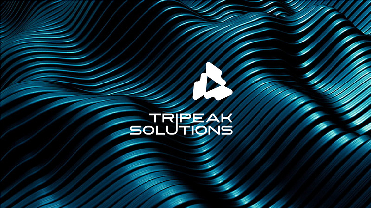
Logo and branding for a consulting firm
Logo and branding for a consulting firm can be viewed at: https://www.behance.net/gallery/179563507/Logo-Brand-identity-for-consulting-firm
TriPeak Solutions is a leading consulting firm specialized in business process optimization.
For the organization, I designed an abstract logo that combines two triangles:
--- The outer one has a contoured edge and stands on its broader base.
The triangle is one of the most stable and robust shapes, signifying the strong foundation that TriPeak Solutions offers to its clients.
--- The smaller inner triangle, pointing to the right, symbolizes upward movement and progress, reflecting TriPeak's commitment to advancing business forward.
It emphasizes a progressive approach, highlighting the company's focus
on the future and innovative solutions.
Unique typography: The fusion of the letters 'i' and 'u' indicates the interconnected nature of the solutions and how each detail is carefully linked and thought out. The unusual right alignment accentuates TriPeak's ability to think outside the box. It also amplifies the notion of moving forward and making progress (moving right and upwards).
