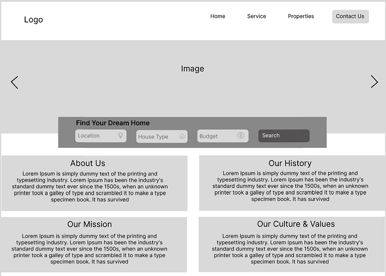
Real Estate Desktop Website Wireframe
Real Estate Website
Description:
I feel website should be easy to use and easy to understand with minimal colors, Designs and image.
Home Page (1st Slide):
I have simplified design, starting with logo then next to logo comes navigation menus like Home, Services, Properties and Contact Us. Then we can add 2 to 3 images of our properties and services for better understanding and user experience.
On Home first Page there will be a filter from where our customers could search their homes by specifying location, home types with budget. And below that we can keep small information about the company, our history, our cultures our missions and I feel it should be small important relevant descriptions.
Services (2nd Slide):
Why choose Us, Here we can keep beautiful image on left side and on right we can add 2-3 lines of tag line. Then I added 4 boxes in that small icon of point and small description and few of the company’s top best services.
Properties (3rd Slide):
We can showcase our best properties available to you, in this we can add all types of best home, it could be from different location and different price. For example, if a user is looking at a home in Mumbai and saw attractive property pictures located somewhere in the town, user might look for those properties as well.
We can add image rates and details and small descriptions.
Contact Us: (4th Slide):
There will be 3 options Email, Call and Chat
Users can also fill in the contact form.
Next slide we have testimonials or reviews section which shows what do our client says and on left side we can add image related to happy customer after service or buying home or where we can express happy emotions. And next to image it will be short review with photo name we can add reviews box as much we can
Then Next slide we can add our partners or integration expertise with logo and name
On the last page will be the same service, platform, community link, connect with us, and their details. And social media logos.


