Logo
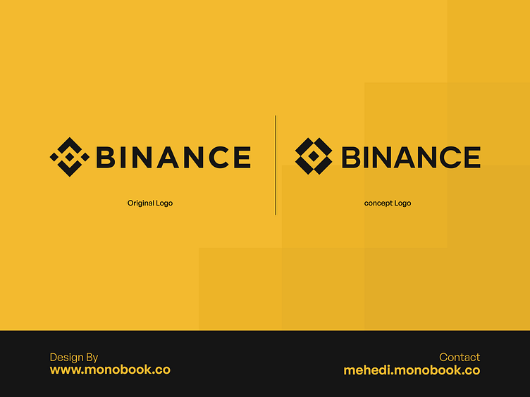
To simplify and modernize the Binance brand identity, focusing on a minimalistic approach.
Design Concept:
We eliminated the large dot and outer frame, refining the middle box to symbolize Binance’s commitment to protecting its users. The logo’s four cuts are retained, representing the platform’s reliability and security, but with a more streamlined and minimal design. We selected the Gilmer typeface for its geometric structure, ensuring it complements the icon and enhances the overall visual harmony.
Outcome:
The redesigned Binance logo is a testament to simplicity and modernity, reflecting the brand's core values of security and user trust in a more refined and minimalistic manner.
Thanks You
If you need to redesign your brand Contact:
mehedi@monobook.co | website | Whatsapp
Like & Comment you thoughts


