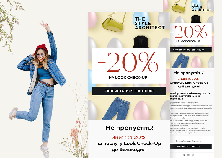
Email Design for the Personal Stylist Web Platform
Proposed Solutions for Email Design
20% Discount
1 Captures attention: "20%" is written in large font in the center of the banner, making it the most noticeable element.
2 Enhances purchase motivation: The discount makes the service more affordable, encouraging people to take advantage of the offer.
3 Highlights the benefit: A 20% saving is a significant amount, which can be a compelling argument for making a purchase.
Limited Time Offer
1 Creates a sense of urgency: People know the offer is only available until a certain date, prompting them to act quickly.
2 Enhances purchase motivation: Knowing that the promotion will end soon, people are more likely to purchase the service now.
Easter Relevance
1 Emphasizes seasonality: Associating Look Check-Up with Easter makes the offer more relevant and thematic.
2 Enhances emotional connection: Easter is a time of renewal and change, so Look Check-Up can be perceived as an opportunity to update one's wardrobe.
Service Description
Informs about benefits: Clearly describing what is included in Look Check-Up helps people understand the value they are getting for their money.
Bright Banner
1 Captures attention: An interesting visual design of the banner with Easter-themed elements makes it noticeable and attractive.
2 Enhances emotional connection: Bright colors and a festive atmosphere in the banner create a positive mood.
3 Emphasizes the theme: The combination of clothing, Easter eggs, and a discount clearly conveys the message of the offer.
Frame Size
1 600 pixels width: This size is optimal for most email clients, ensuring the banner displays correctly.
2 Height up to 2000 pixels: This provides enough space to include all necessary information and visual elements without making the banner too bulky.
For collaboration inquiries and further information, please contact:
uliafechan@gmail.com or @uliana_lesiuk in Telegram.
Follow me on Linkedin
