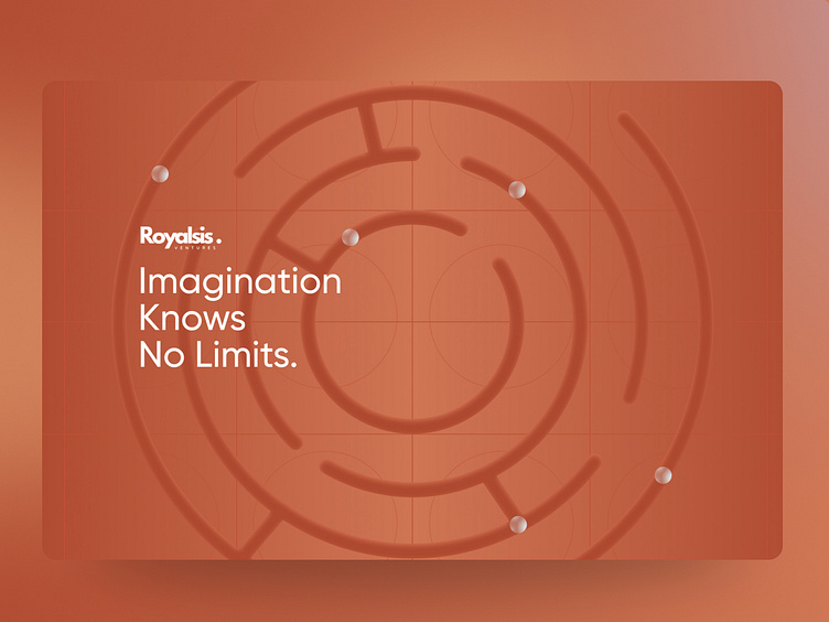
Royalsis Showcase: A Modern Approach
Experience Royalsis: Dive into an elegantly crafted landing page that exemplifies innovation through its seamless responsiveness and intuitive interface.
---------
Developing digital products since 2017.
Let's collaborate to turn ideas into effective digital solutions. Explore my portfolio for more information. 🚀💡🎉
🌍 Visit Portfolio Site: https://rahuldambhale-ux.framer.website/
or
💌 Email: rahulmsd1234@gmail.com
When ensuring a responsive design for the "Royalsis" Landing page, focus on these key points:
User-Centric Design: Focus on user experience and easy navigation.
Clear Call-to-Actions: Highlight important actions for user interaction.
Visual Hierarchy: Guide users with effective visual elements.
Consistent Branding: Maintain brand identity through design consistency.
Mobile Responsiveness: Optimize for seamless experience on all devices.
Whitespace: Use ample space to enhance content focus.
Engaging Visuals: Include relevant and attractive images.
Fast Loading Speed: Optimize for quick page loading.
Feedback Mechanism: Enable easy user feedback and inquiries.
When designing the responsiveness of the "Royalsis" Landing page for Tablet and Mobile View, consider these points:
Responsive Grid: Utilize grids for consistent layout on tablets and mobiles.
Optimized Images: Use fast-loading images for better performance.
Touch-friendly Elements: Design elements easy to tap on touch screens.
Content Priority: Arrange content for readability and importance.
Simplified Navigation: Streamline navigation for easy access.
Font Legibility: Ensure fonts are clear and scalable.
CTA Placement: Position CTAs prominently for user direction.
Testing: Test on actual devices for a seamless experience.
Consistent Branding: Maintain branding consistency for a unified design.


