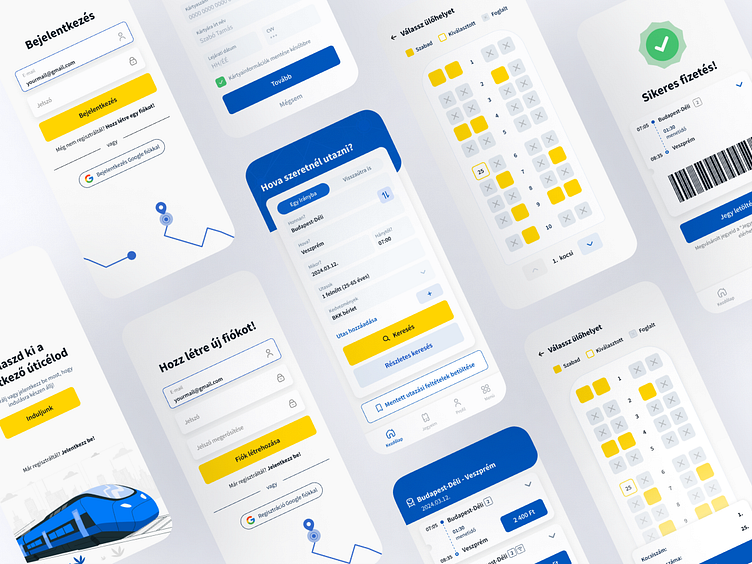
Hungarian Railway Ticket App - Redesign Concept
Quick Intro
The current Hungarian railway app is out of sync with UI/UX trends, and many users have voiced their concerns about it. The app has complicated and hard-to-navigate processes, lacks convenient features and displays information poorly.
So as a challenge I decided to make a redesign concept for the app interface in a more modern and user-friendly way. ✨
"Departure Station"
Besides wanting to create a completely new and intuitive UI, I also felt it was important to integrate a Google account login option to facilitate the process.
"At the ticket window"
For the travel search screen, I aimed to create a user-friendly interface that is easy to navigate with convenient functions integrated.
Seat reservation and live tracking
Here, you can smoothly reserve your seat using a visual booking tool and after that you can save your card informations for the next checkout process.
After purchasing your ticket, you can easily track your position on a map.
Checkout
On the checkout summary page, you can review the details of your selected ticket and your billing and payment settings.
Thanks for watching ✨
This case study is solely for personal practice and portfolio presentation; it is not intended for commercial use.


