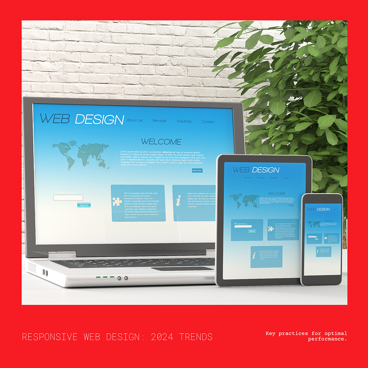
Best Practices for Responsive Web Design for 2024
As we dive deeper into 2024, the importance of responsive web design continues to skyrocket. With an ever-expanding array of devices and screen sizes, ensuring that your website adapts seamlessly to various platforms is essential for providing an optimal user experience. Here are some best practices for responsive web design in 2024:
Mobile-First Approach: Embrace the mobile-first approach, where you prioritize designing for smaller screens before scaling up to larger ones. This ensures that your website remains functional and visually appealing on mobile devices, which are increasingly the primary access point for users.
Flexible Grids and Layouts: Implement flexible grid systems and layouts using CSS Grid or Flexbox. These tools allow your content to adapt dynamically to different screen sizes, maintaining consistency and readability across devices.
Media Queries: Utilize media queries to apply specific styles based on the device's screen size and orientation. By adjusting typography, layout, and image sizes accordingly, you can optimize the viewing experience for users on desktops, tablets, and smartphones.
Fluid Images and Videos: Ensure that images and videos resize proportionally to fit various screen sizes. Use CSS properties like max-width: 100% to prevent images from overflowing their containers and maintain visual clarity across devices.
Progressive Enhancement: Embrace a progressive enhancement approach, where you start with a solid foundation of core functionality and then layer on additional features and enhancements for devices with more capabilities. This ensures that your website remains accessible and functional for all users, regardless of their device or browser capabilities.
Performance Optimization: Prioritize performance optimization to ensure fast load times on all devices. Compress images, minify CSS and JavaScript files, and leverage browser caching to minimize latency and enhance the user experience, especially on mobile devices with slower connections.
User Testing and Feedback: Conduct thorough user testing across various devices and screen sizes to identify any usability issues or inconsistencies. Gather feedback from real users to understand their preferences and pain points, allowing you to iterate and refine your responsive design accordingly.
By following these best practices for responsive web design in 2024, you can create websites that deliver a seamless and engaging experience across a diverse range of devices, ensuring that your content reaches and resonates with users wherever they are.
