Lannock
Colours
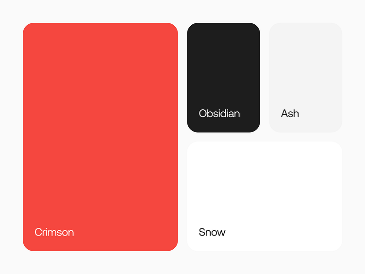
We uplifted the iconic red to be a little less vibrant to come across more modern and less confronting.
The rest of the colour scheme follows a neutral grey scale to keep the contrast high for readability without the need of adding any additional tint.
Full Case Study on Behance 🤘 https://www.behance.net/gallery/196034489/Lannock
More by Lorenzo 🤘 Bocchi View profile
Like
