BRAND BANNER AND FLIER DESIGN
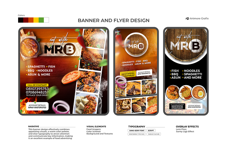
The banner design for "Eat with Mr B" is vibrant and eye-catching, effectively utilizing visual elements and typography to covey its message. Join me and explore this wonderful project.
I decided to use mock ups to show how it looks in real life on the street, please enjoy the view.
The banner effectively balances text and imagery, ensuring neither overwhelms the other. The strategic placement of text around the images allows for a clean, uncluttered look.
The use of layering and overlapping elements (e.g., the chili pepper and tomato slice) adds a sense of dynamism and liveliness, making the banner more engaging.
These are my views concerning this project, however i'll welcome your opinion, what do you think of it, please use the comment section to mention.
Thanks for viewing and please follow me for more.
More by Olayiwola Ezekiel View profile
Like


