The Colour Bar - Luxury Hair Salon
The Colour Bar
The Colour Bar is the epitome of luxury in the world of hair salons, where client experience takes center stage. Expert stylist Mickala was ready to expand her expertise beyond her shop and into a full-fledged salon. Her commitment to both cutting-edge industry trends and unparalleled client care ensures that every visitor leaves feeling as stunning as they look. Mickala envisioned a salon exuding comfort, beauty, and top-tier professionalism.
The Logo
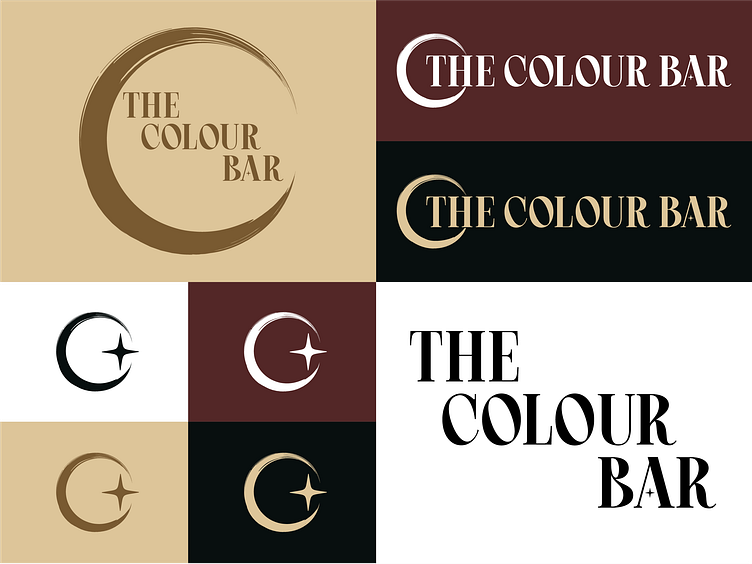
She requested a logo featuring a brush or brush stroke and planned to announce her grand opening during a solar eclipse. This information was enough to get my creative gears turning. I found that a brush stroke in a crescent shape not only works as a "C" logomark, but could represent astrological elements like an eclipse or a crescent moon. Using a 4 pointed star and a character and brand accent tied this concept together.
The Color & Typography
I wanted the brand colors to be a blend of natural and ethereal tones, but still show sophistication. White, Wheat, and Coyote evoke a sense of relaxation and luxury, perfectly aligning with The Colour Bar’s high-end ambiance. The wine color, Caput Mortuum, enhances the palette with its refined presence, complementing the other colors seamlessly. Night contributes added contrast but is intended to be used sparingly, which ensures a bright and tranquil environment.
As for the fonts, I chose Crimson Queen for the main font a neoclassical serif font, is a neoclassical serif font. In the league with DIOR and Tiffany, this font conveys a luxury feel with relaxed undertones shown in the the subtle curve of some letters. Tenor Sans is a legible sans serif font that is cohesive with Crimson Queen, yet still has enough contrast to tie the brand together. As an accent, Cetary is a legible and feminine script font that shines in social media posts and smaller brand assets.


