Royal Treat Butter Cookies
Visual Appeal:
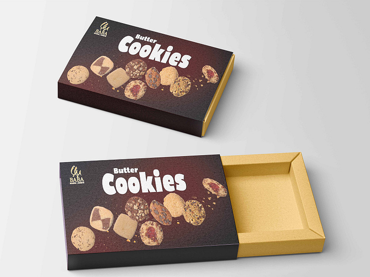
The design showcases a variety of butter cookies prominently on the packaging. The assortment displayed highlights the different textures and flavors, making the product visually appealing to potential customers.
Dark Background:
The dark background contrasts well with the light-colored cookies, making them stand out. This choice enhances the visual impact and draws attention to the product.
Typography:
The font used for "Butter Cookies" is bold and playful, conveying a sense of fun and indulgence. The white color of the text against the dark background ensures high readability.
The brand name "BABA Bakers & Sweets" is positioned at the top left, maintaining brand recognition.
More by Junaid Ijaz View profile
Like
