MIKHAS
The edible oil industry in India is booming, with growing market demand that keeps product prices rising accordingly. Monetising a gap in the Product category is possible with a strategic branding and package design. As long as the quality and the brand promise shines through - edible oil products are fast moving household products.
Mikhael Foods Ltd. comes in with an experience of 2 decades plus in manufacturing and selling edible oils of 3 types - Coconut, palm and gingelly. With Mikhas edible oils they leveraged their production capabilities and market demands by launching an affordable and trustworthy oil brand that had maximum accessibility to a broad target audience.

Branding
When a brand’s values and missions evolve, so does its visual identity! The branding strategy involved researching product positioning and collecting market data, to formulate multi-faceted design improvements that align with their newfound vision. For Mikhael Foods, we applied a two-step approach that differentiated between their corporate identity targeted at investors and their product identity majorly for retail consumers. The branding process of Mikhas was essentially product-centric, fixating on a simple yet informative style that conveyed its value proposition to potential customers.
Packaging
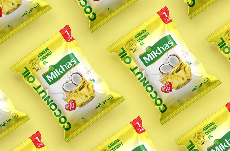
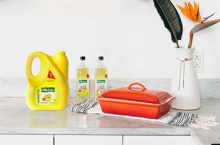
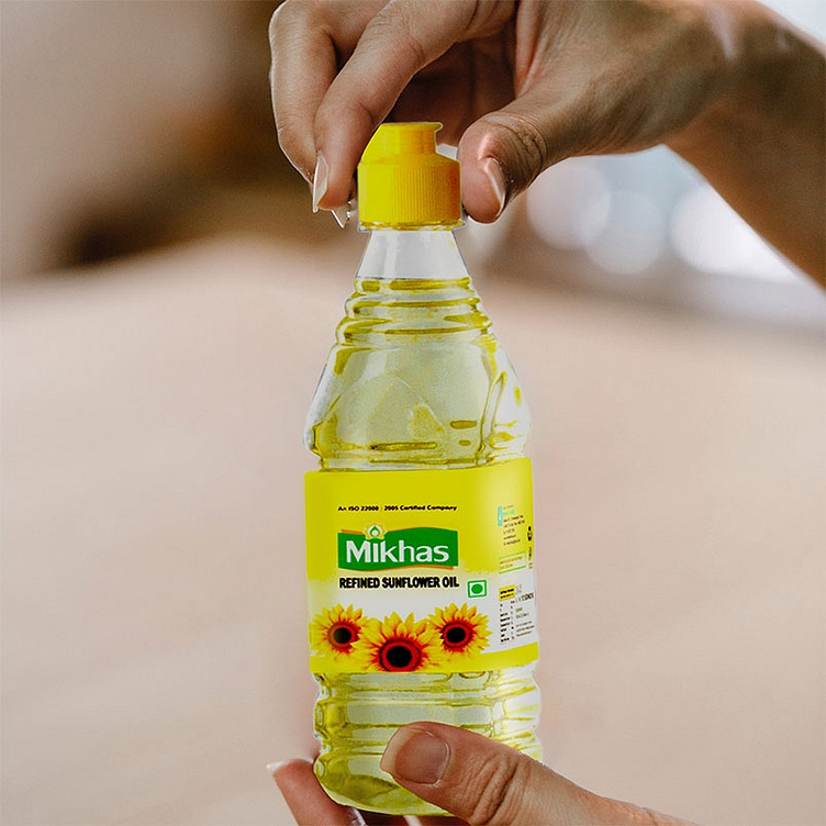
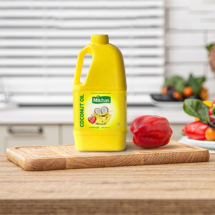
Integrating functionality into packaging is always our primary strategy. The design had to portray recognisable and effective symbols through an uncluttered visual presentation. By ensuring that there’s a clear legibility of text and using colours and graphics that are relatable and familiar to the target audience, the product can then be marketed to an overarching, wider consumer demographic.
Collaterals
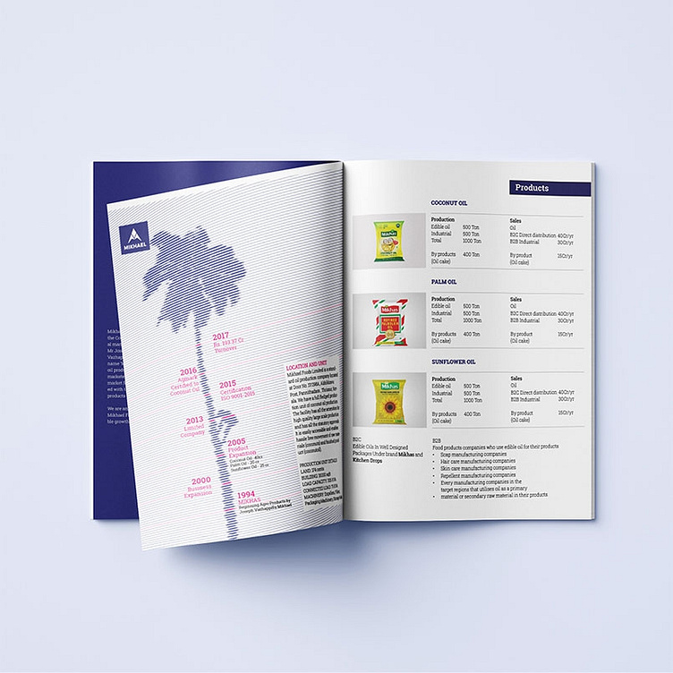
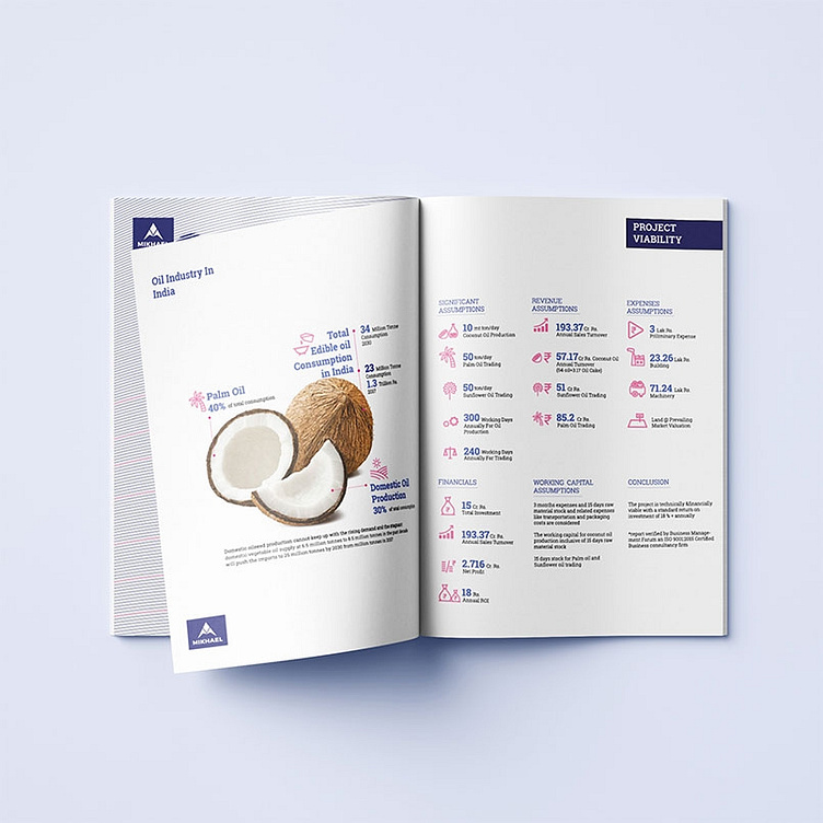
After analysing the previous data for the company - that outlined its journey from inception to expansions, we developed a corporate brochure that - when presented in about 5 pages - would give a brief rundown of the company’s inner workings and accomplishments.
The goal was to make the brochure informative, stylised, yet distilling the data for the investors, which necessitated switching to a unique and sophisticated sense of appeal, doing justice to the vast industry experience of Mikhael Foods.
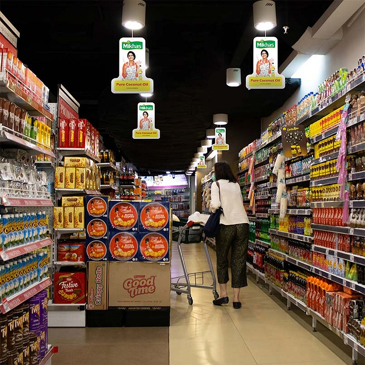
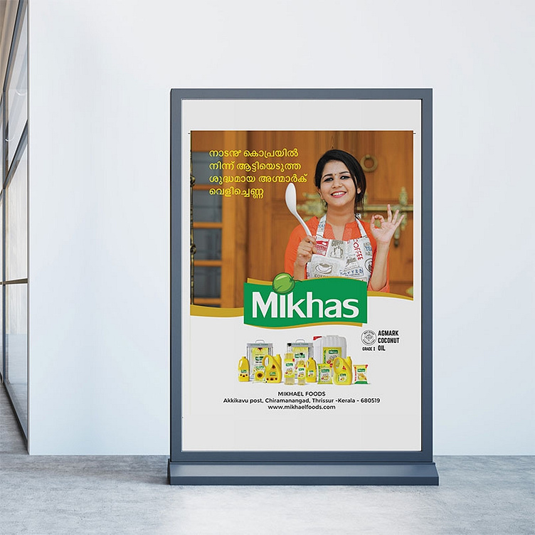
The poster and danglers were designed in keeping with the Mikhas brand image and themes generally associated with good quality coconut oil. Colours like gold, red, green and white were used here with the express purpose of evoking positive emotions tied to health, nature, family, culture and tradition.
These tend to catch the eye of potential customers while also creating an identifiable language and persona. We have also tried to instill brand trust here through a prominent, strategically placed logo mark, which, along with other design consistencies, helps imprint a lasting image of the brand in its audience.