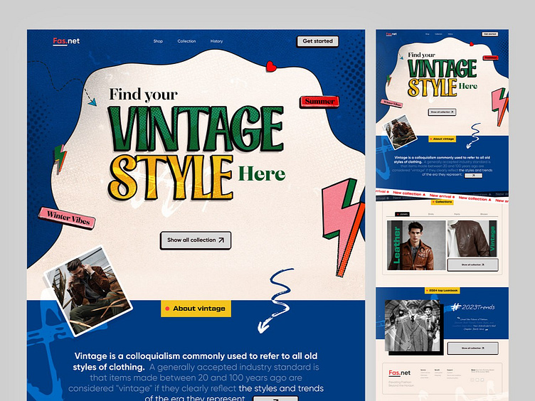
Vintage Website Landing Page UI Design
Mockup Preview ✨
Section Preview ✨
Full Preview👀
"Vintage Website Landing Page UI Design"
We created a vintage clothing website using Figma, and it was a delightful challenge. Infusing the design with authentic vintage vibes required delicate consideration of typography, color, and layout balance. I selected a palette of warm and muted tones and fonts to evoke nostalgia. The layout integrated vintage elements for an immersive journey through time, resulting in a modern web experience filled with the essence of vintage aesthetics.
Hope you like it; feel free to give feedback, and don't forget to press "L" or the love button if you like it.... 😊
Visit our website www.olack.agency
Say hi.?
Drop us a few lines at hello@olack.agency
Get in touch
WhatsApp | Telegram | Skype | Cup of coffee with Olack
Stay tuned for our updates at
More by Olack View profile
Like


