BURATINO MENSWEAR | LOGO DESIGN & BRAND IDENTITY
As a symbol of sophistication and class in each high-end shirt, with the mission of bringing customers the perfect fashion experience, Buratino always puts quality and customer satisfaction first, through constantly creating and perfecting each product
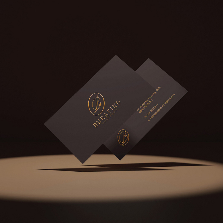
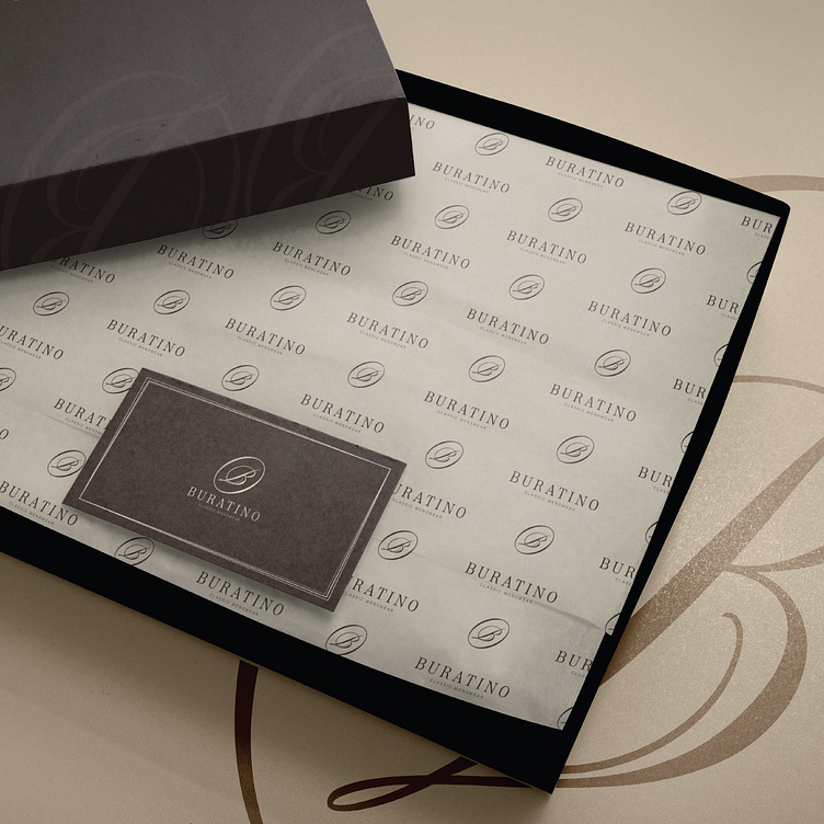
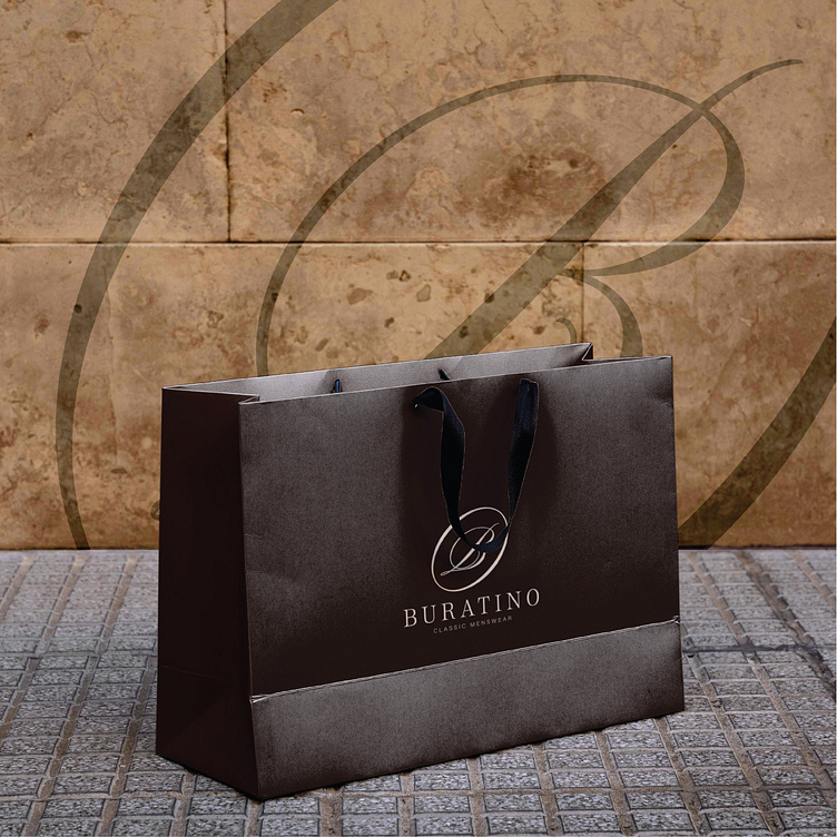
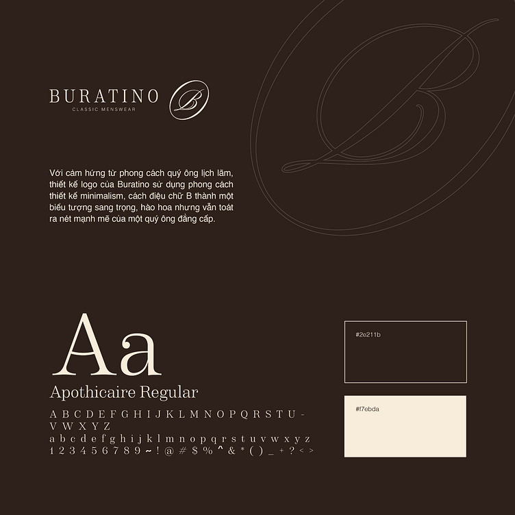
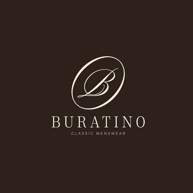
Inspired by the elegant gentleman's style, Buratino's overall brand identity is the perfect combination of sophistication, class and modernity. The main colors, design elements and icons are all carefully selected to reflect the core values of the brand. Buratino's logo design uses minimalism, stylizing the letter "B" into a luxurious, pompous symbol but still exudes the strong features of a classy gentleman. The letter "B" is stylized simply but delicately, combined with strong lines, expressing certainty and stability, symbolizing the sustainability and prestige of the brand.
Brown as the main color of the brand brings a sophisticated beauty and elegant style. All create the perfect combination of tradition and modernity, showing the sophistication in each needle and unique fashion style that Buratino brings.
Designed by Bee Art
-
Client Buratino
Logo and Branding Project. Logo is designed for Menswear Brand in Vietnam.
Copyright© Bee Art. All Right Reserved
Contact us:
• Hotline/ Zalo: (+84) 77 34567 18
• Email: info@beeart.vn
• Website: www.beeart.vn
• Facebook: https://www.facebook.com/BeeArt.vn