Garden of Knead'n Logo Design
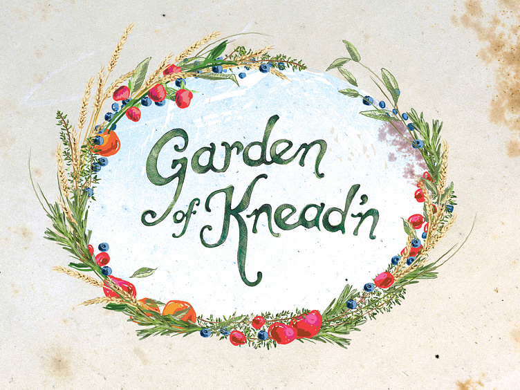
Hand drawn entirely, from text to wreath elements. We went through many permutations of the fruit and veggie illustrations, from scribble-sketch to highly rendered. The final design has a combination of both, all made on ipad with apple pen.
The text is pencil and watercolor, scanned and layered, then tweaked digitally on ipad. I used a few different letterforms that appealed to the client as inspiration, and the final output was designed to look like it might have been poured in syrup.
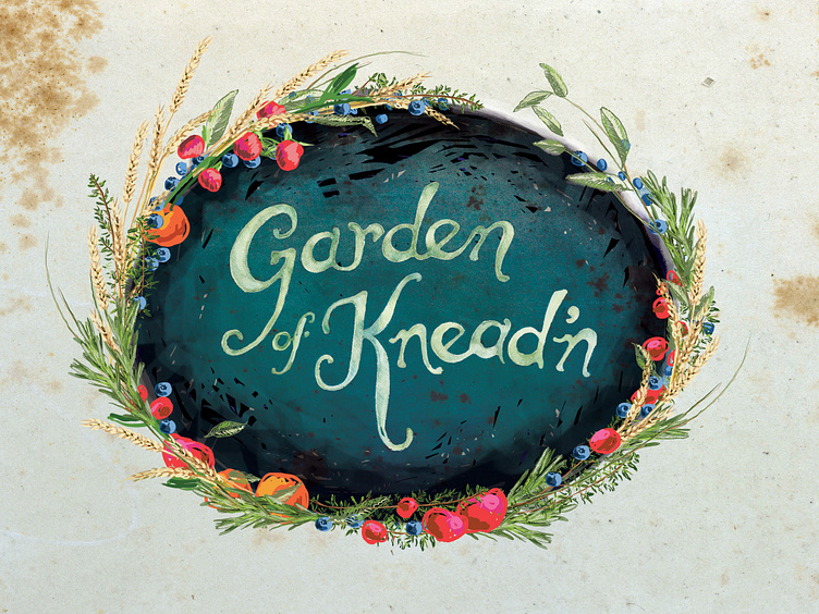
The inverse/knockout treatment has a different text treatment (all a combination of layering and digital effects) and background altogether, though the wreath is mostly contiguous.
