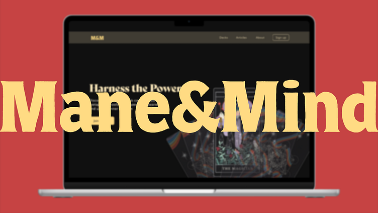
Mane&Mind: Tarot app for Vision Pro (Conceptual)
Design Process
Mood boarding and Research🍳
I began by jotting down everything the brief, questions, tasks, and my ideas for approaching them. I also conducted competitive research to identify gaps and understand the user demographic. Here’s what I discovered:
Users: aged between their early 20s and late 50s, interested in personal growth and mindfulness.
Competitive analysis: They offered services like daily reading, sessions with experts, and telling horoscopes using AI.
User research: Asked peers about what they know about tarot reading and their experience in our community channel.
Goal: Develop a product that educates and guides users in mindfulness through tarot, fostering a supportive community for personal growth.
Information architecture and wireframes🥣
Here’s how I approached creating the IA and wireframe:
I created the IA on a whiteboard, ensuring it followed the AIDA framework. I sketched 4–6 screens on the whiteboard to visualize all my ideas, adding some small details.
I refined the sketches with ChatGPT, ensuring clear wording on buttons and labels.
I used a digital tool called Relume to turn the sketches into more polished wireframes.
Brand Identity🍂
While listening to the audiobook “The Laws of Human Nature” by Robert Greene, I came across an ancient Greek metaphor of the rider and the horse. Intrigued, I researched this metaphor and found that, in earlier times, riders often used the horse’s mane for support, balance, and control, especially when riding bareback. Gripping the mane helped riders stay connected with their horse and communicate effectively.
In this metaphor, the horse symbolizes powerful yet wild emotions, while the rider represents rationality and guidance. For success, they must work together harmoniously. Inspired by this metaphor, I came up with the brand name
“Mane and Mind.”
Visuals and Prototyping🍲
Here’s how I did it:
I found the card images on the competitive website and downloaded high-resolution versions. I also messaged the artist for their consent.
To create the logo, I initially used Adobe Firefly, but eventually, I settled on a font style and created a visual reference in Photoshop. Additionally, I selected the font style.
Usability Test
I shared this version with my peers and asked for feedback. Here’s what they said:
It’s not clear what the website is for; please mention ‘Tarot’ in the hero section.
The UI looks okay, but the UX needs improvement.
To give some context, I’m primarily a graphic designer, responsible for making things visually appealing. However, transitioning to product design required me to delve into the ‘why’ and ‘how’ behind my design choices. This shift has been challenging, as I’ve been set in my ways for the past three years. Now, I’m in the process of unlearning certain habits. Nonetheless, I’ve made numerous changes and, ultimately, created something tangible.
Conclusion🍝
Faced problems like choosing the right project, creating a brand identity, and understanding how to design for the right platform.
Solved these by setting deadlines, asking mentors for help, and finding inspiration from different sources.
Improved my design by using feedback, doing good research, and being flexible with changes.
🟢 Open for work.
I would love to hear about your idea.
📭 Reach out via mail: theimaginarystation.com
⚡️ Follow on Linkedin for more detailed updates.
📜 Checkout full case study here


