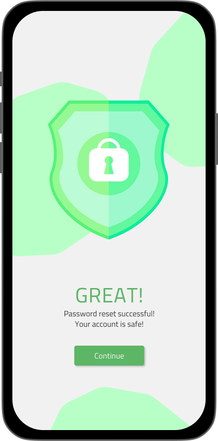
Flash Message
As I go through each challenge in dailyui, I realize that using simple and neutral colors more creates better visual presentation.
That's exactly what I was doing here in this flash message challenge. Using off-white background and different shades of red and green for fail and success flash messages for a password change.
More by Marc Lawrence Salaguban View profile
Like

