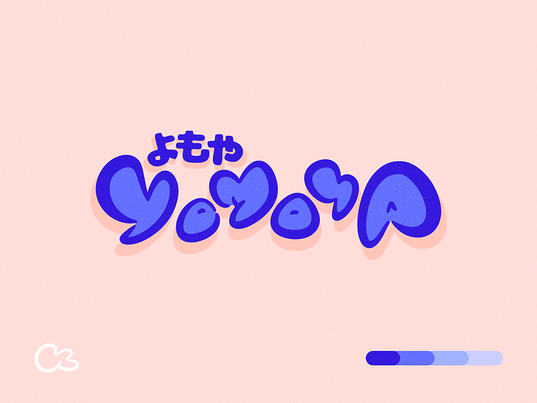
Yomoya Logo Concept
Hello dribbblers 🏀
I've designed a unique typography for "Yomoya" that captures the modern and accessible spirit of our place. The rounded and fluid shapes of the typography pay homage to the simple elegance of Japanese culture, carefully avoiding clichés. The color palette, a harmonious mix of blues on a salmon background 🍣👀, creates a soft and welcoming atmosphere, perfect for a place where you love to relax and spend time.
This is a concept logo aimed to represent "Yomoya" as a warm and innovative space where manga enthusiasts can gather in a setting that respects and celebrates Japanese culture. I believe this logo successfully conveys these qualities and warmly invites visitors to explore all that "Yomoya" has to offer 🙌🏼
I've made sure to steer clear of clichés, both in color choice and design, ensuring our identity stands out while staying true to its inspiration.
I'm excited to share this concept logo on Dribbble and look forward to your feedback!
Let's make some magic happen!
