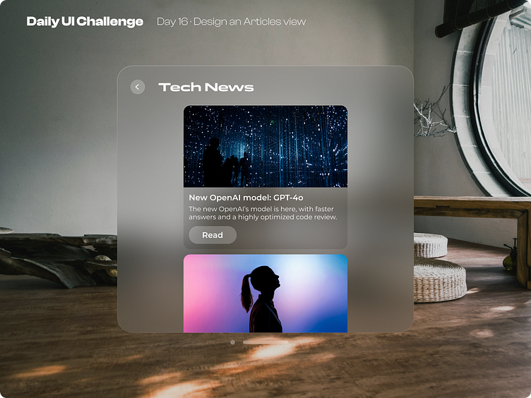
Day 16 of improving my UI skills · #16 Design an articles view
Process
Day 16 was about designing an articles view. I've always wanted to experiment with spatial computing design so I did it. This was a difficult process, because the resources had some issues with the colors and I had to play putting more than one color in the fill and well I also tried to make it by my own from the beginning but it looked like 80% accurate so I looked up the reference with the colors and I finished the design by doing this.
What I would change
I'm gonna make more designs for spatial computing for sure, it was very fun and difficult to simulate apple's designs for visionOS. The most difficult thing with this design is to move it on top of a whiter space because of the contrast so that's what I would like to play with and experiment to find solutions.
This is a public challenge made by hype4 academy (or SquarePlanet I don't know).
Background image from Unsplash.
Referencing resources from Apple's Figma community files
