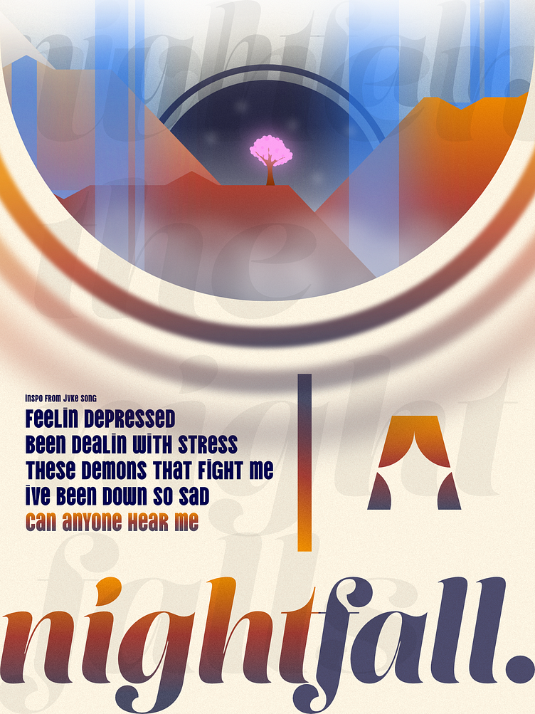
nightfall + branding.
nightfall.
The inspiration for this poster is a song called "this is what sadness feels like" by JVKE. I was sat in the airport listening to songs, when this song played in my ear, and I said to myself, "Wow, I could use this for a design!" I then opened my computer in the airplane and was fiddling with different shaped until I ended up with this. Its a new style of art, and I quite like it. Let me know what you all think about this.
(edit: I am not depressed that is just the lyrics of the song 😄)
As for the colors, the orange-red-blue gradient was inspired from the wallpaper on my computer, which is OS X RANCHO CUCAMONGA by BasicAppleGuy. That design even inspired the idea of a lone tree. I have included the full art below.
Overall I am pretty happy with this!
branding.
This art I made inspired me to create a new banner and a new color theme for my branding. I have attached it below, so let me know what you think. Any feedback would be helpful!


