Airbnb Usability Test
The more traffic a website receives daily, the more errors are likely to occur.
Even a relatively low error rate like 0.1% means that one billion visits a day would translate into one million errors, every day. This shows the need for continuous and robust testing on the most highly trafficked sites.
At-a-Glance
When our school announced this assignment, I thought, "Really? Airbnb? This website is perfect, we won't find anything", then the testing part started... As an observer, my jaw dropped a few times watching how lost some users felt! Let me walk you through this case study, starting with the boring but important legal stuff.
Timeline
One week
My role
UX Researcher (I contributed to script development, pilot testing, recruitment, and consent forms. I planned tests and prepared usability test reports. I observed the testing of all participants and created sketches and design iterations based on users' feedback)
Collaboration
One team member
Platforms used
Google Sheets, Figma, Miro, Teams
Business Goals
Enhancing user experience by ensuring a smoother, more user-friendly Airbnb platform
Identifying and fixing issues will lead to more positive reviews
Reliable functionality fosters trust among users, encouraging repeat bookings and revenue growth
Fewer frustrations mean lower churn rates and more loyal customers
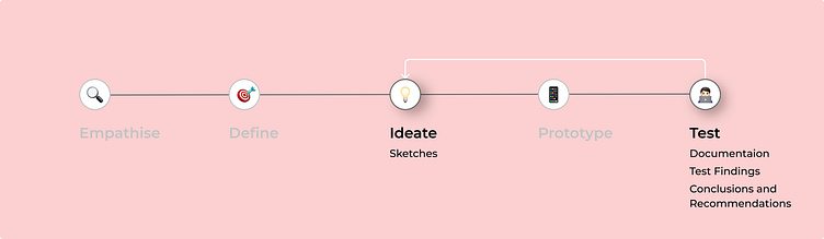
Process
This project was a school assignment with a primary focus on usability testing. Following a linear process, we moved from usability testing to the ideation stage, where we sketched various design iterations based on our findings. For this case, we involved five participants, each participant was presented with the following task: finding accommodation for a two-night stay in California, adhering to a budget of 4000 NOK, locating an entire place with Wi-Fi and breakfast, specifying the cabin type property, and ensuring the option for free cancellation.
It's All About a Good Plan
Methods
Moderated, remote
Scripted and task-based
Retrospective Probing
Screeners were utilized to filter the right participants
Data gathering and analysis were conducted within the spreadsheet
Script to ensure the right focus and consistency
Ethical Considerations
Informed consent was provided before usability testing, explaining the purpose and tasks involved
GDPR agreements are sent by email and signed before
Transparency was maintained regarding usability testing tasks and goals.
Responsibility for handling the personal information of all users
Voluntary participation only, with the option for participants to withdraw from the studies at any time
Ensured confidentiality and anonymity
Implementation of secure data storage to enhance information protection for test participants
Essential importance is placed on ensuring participants feel safe and comfortable throughout usability testing sessions
Metrics
Completion Rate
We employed the completion rate as a metric to assess the users' ability to navigate the website and achieve their objectives
Completion Time
We wanted to know something about the average time the user would spend to complete the task we had given them, so we could understand more about whether the website lived up to the users' expectations
Satisfaction Rate
Understanding the overall usability of the website was a key priority for us. To achieve this, we followed up with participants, asking them to provide ratings of their overall experience. This approach aimed to gather qualitative data that could inform future design iterations and possible improvements
Usability Test Report
The satisfaction rating of 4.4 indicates a relatively high usability level. However, certain issues need to be addressed. Two participants took significantly longer than the average time to complete the task (18 and 12 minutes versus 4 and 7 minutes). Given the high traffic on Airbnb's website, the difficulties faced by 2 out of 5 participants are noteworthy. Observations during the test and follow-up questions revealed that users had problems understanding the filter and search bar features.
Findings and Suggestions
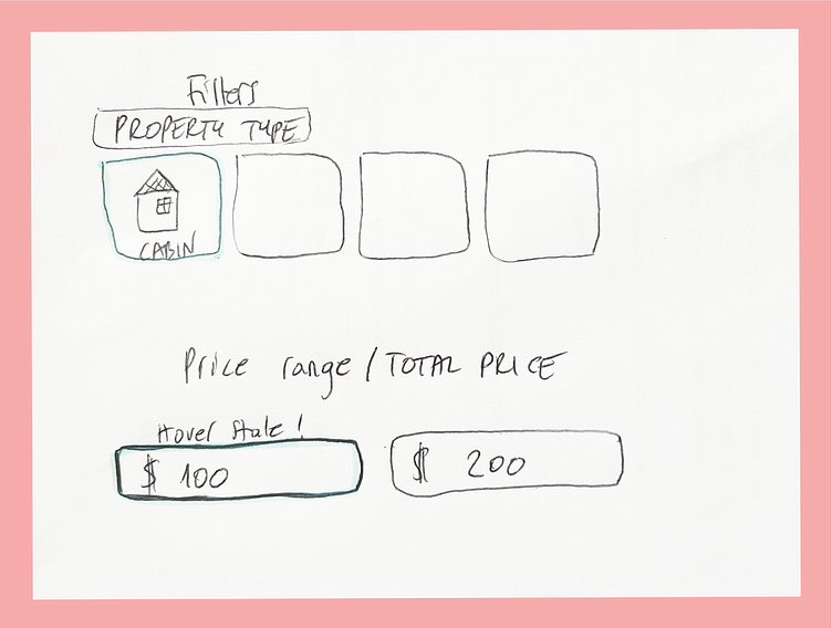
Task 1 Choosing Property Type
"I rate the app 4 out of 5 because of this cabin option when I had to choose it five times on the way" - Dominika
This issue arises when users have already specified in a previous step that they want a cabin. The filters confuse users, as they are unsure whether the "cabin" filter has been saved. Additionally, there is no suitable option for users who want to specify a cabin in those two filters.
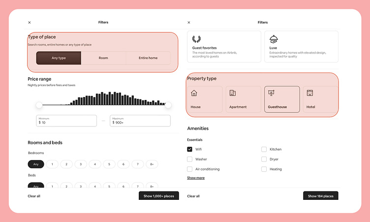
Teams suggestions:
Removing the "property type" and "place type" filters if the user has already chosen these options from the main carousel menu
Keeping the "property type" and "place type" filters, but implement a carousel with all options for property types
Task 2 Specifying the Budget
Since the user has already specified the number of nights they would like to stay, they expect the system to display the "total price" based on their previous specifications.
"If the main search asks to select the max budget for two nights per two people then it should also have the filters reflecting that particular choice of the client automatically. In the initial search, I stated that I was looking for 2 nights. I felt this was an unnecessary time eater" - Dagmara
"I also found it misleading that the prices for each night were the ones showing up after I had chosen the duration of my stay. I can see how specifying each night's price is an acceptable option, as it represents the standard rate for the place. However, the 'each night' option should be clearer" - Rolf
The user gets stuck on the moving chart instead of typing the amount in the input field. We believe the reason for this may be the lack of a hover state in this particular component.
"It was ok, I always get stuck on this moving part instead of typing thing, it a little frustrating cos I can never find exactly 2000 in this case so i just type it at the end anyway" - Dominika
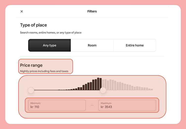
Teams suggestions:
Removing the animated budget chart choice, as it's hard to select the exact price using it. Writing the amount straight away in the input field would save some time
Showing the budget price for the entire stay, not just for one night
Implementing component states for input fields
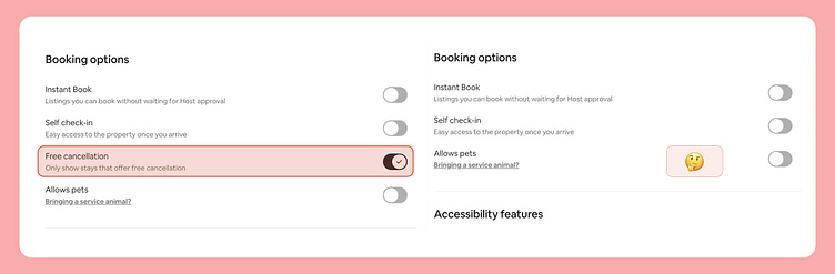
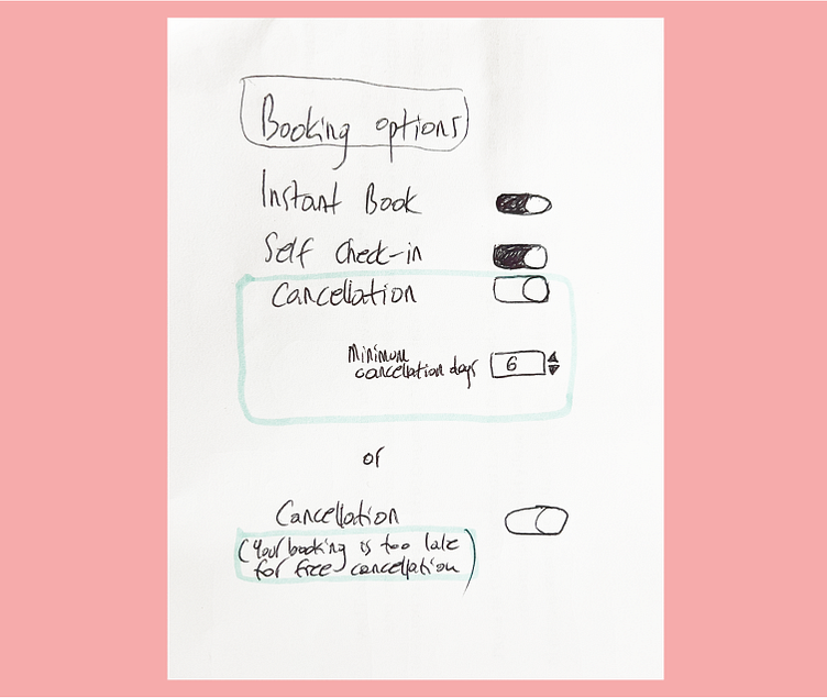
Task 3 Free cancellation
Users experience cognitive overload when they have to read through each ad's details to find the cancellation policy, they get frustrated because they can't find the cancellation feature. Looks like the cancellation option disappears when the user chooses just a few days ahead.
In some cases, users would like to specify how many days in advance they need to feel secure and "in charge" when making the booking.
"The free cancellation option was a bit more tricky. I couldn't find that option in the filters, so I had to check each property" - Henriette
"I would like to have a search window where I can simply type '10 days cancellation option' so I don't have to go into every single cottage to look for those details" - Dagmara
Teams suggestions:
Giving users the option to filter by their preferred cancellation policy duration, so they don't have to visit each cabin to see the cancellation policy offered by each place
The cancellation filter should never disappear; instead, it could be deactivated with a message saying "Booking too late for cancellation option"
Other suggestions from our users
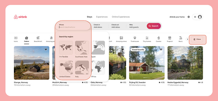
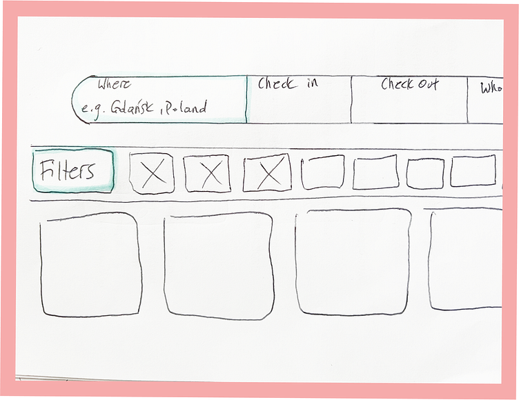
One of the users spent a tremendous amount of time trying to find a city using a world map instead of typing it in, which felt like a mission impossible, the "where" field should indicate that users can type in the search field instead of using the drop-down selection map menu. Another thing is that "filters" should be prioritized and made more accessible.
"It made me irritated that I could not find out how to search for a city, for some reason I did not think of typing, which I normally would have done"
- Henriette
"Didnt like the filters thing, I would love for the filters to be first, I think it was very clunky" - Rolf
Teams suggestions:
The placeholder text could provide more detail about what can be searched for, such as "Gdansk, Poland"
The filter field should be prioritized, and we should implement it on the left side
What I Learned
This project highlighted the importance of robust testing of existing platforms. Continuous testing not only ensures that the user experience remains optimized but also enables designers to stay tuned to evolving user needs. While initially, I didn't anticipate this project to be particularly engaging, I soon discovered how mistaken I was, in fact, this project quickly became one of my favorites. I love usability testing; it feels like returning to the empathize stage, where we strive to understand the most important aspect of the design — our valued users.
Thank you for taking the time to review my portfolio!
If you have any questions, feedback, or suggestions, or if you would like to explore the possibility of working together, please don't hesitate to contact me at paulina.malinski@gmail.com
