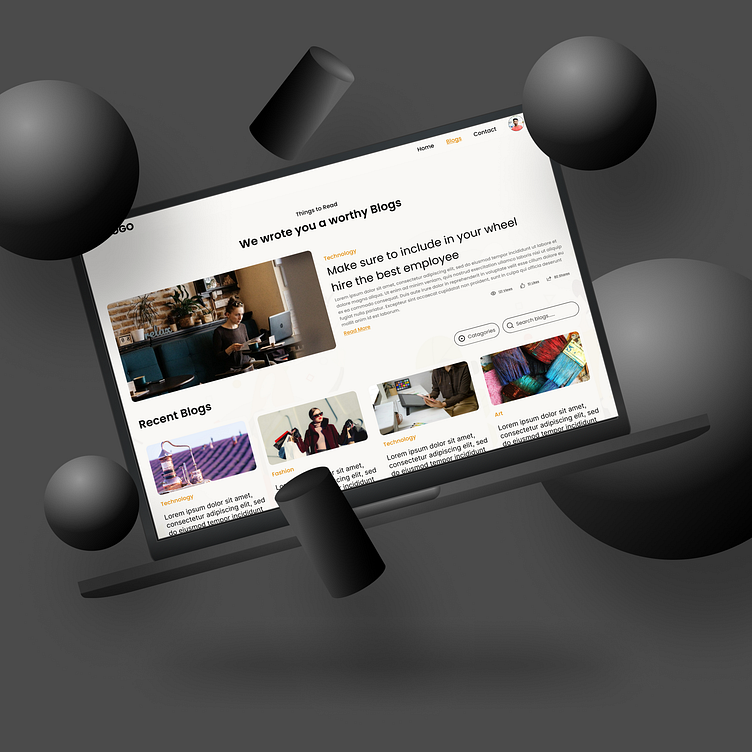
Blog Post Layout Design
Hey Dribbble community,
I’m excited to share my latest design project with you all – a blog post layout that emphasizes simplicity and elegance. This design was created using FIGMA, and my approach was to craft a clean and aesthetically pleasing layout that enhances readability and user engagement.
Here’s a closer look at the details:
Key Features:
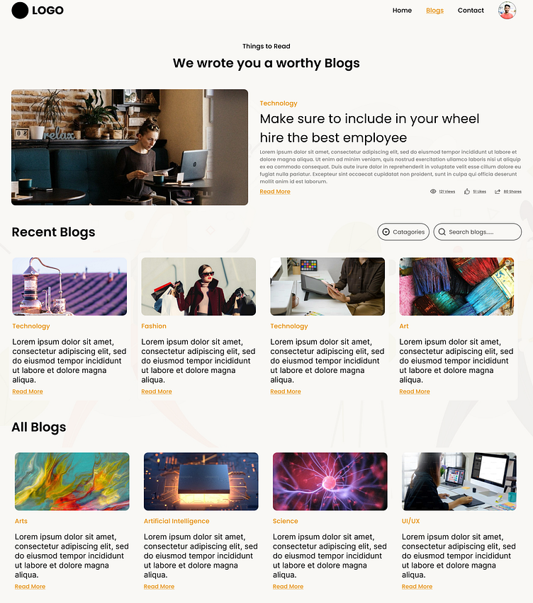
1. Minimalist Design: The layout features a minimalist design with ample white space, ensuring that the content is easy to read and visually appealing. By reducing clutter, the design allows readers to focus on the main content without distractions.
2. Typography: I chose a sophisticated and legible font pairing to create a harmonious visual experience. The headings are bold and distinctive, while the body text is clean and readable. This contrast helps to guide the reader's eye through the content smoothly.
3. Responsive Layout: Understanding the importance of mobile-friendly designs, this layout is fully responsive. It adapts seamlessly to various screen sizes, providing an optimal reading experience on desktops, tablets, and smartphones.
4. Visual Hierarchy: To enhance the reader's journey through the blog post, I implemented a strong visual hierarchy. Key elements such as the title, subtitles, and call-to-action buttons are strategically placed to capture attention and improve navigation.
5. Color Palette: The color palette is intentionally kept soft and neutral, creating a calming effect. This choice not only makes the content stand out but also provides a pleasant reading environment.
