Daily UI Challenge 2: Credit Card Checkout
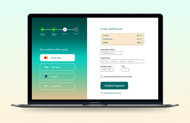
Hello everyone! For this second day of the Daily UI Challenge, "Credit Card Checkout", I decided to go for a simple screen that shows some specific details for the user:
In which step the user currently is,
Different options for payment,
A reminder of the total for their purchase,
A « Go back to previous step » option, that I decided to implement instead of a simple arrow on the top of the screen, after some user testing with my best tester - aka my wife - who found the arrow alone a tad confusing.
In the typography, I went for the classy Libre Bodoni for the headings and the steps, and the simple and yet elegant Helvetica Neue for the body.
To choose the colors, I used the Dictionary of Color Combinations, "Haishoku Soukan", to see what could work best together in dual tones. It was great to use this dictionary as a tool for inspiration, it’s definitely a must have for all designers :)
Hope you enjoy it as much as I do!
#dailyui
