Revisiting Bradshaw’s Guide
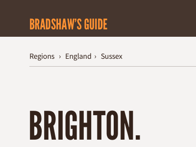
An early comp to consider what a reimagined Bradshaw’s Guide might look like. I’m thinking of using a different, unassuming sans typeface (Source Sans) for UI and navigation, with Charter, League Gothic and Kameron used for guide content. It’s a lot of fonts, but this should help replicate the Victorian eclectic aesthetic. We’ll see.
Also looking to source public domain imagery to support key articles. Examples, like this of Brighton sea front, really help lift the design and make the content more engaging. Hopefully I can find plenty of good public domain images like this.
More by Paul Robert Lloyd View profile
Like

