Oligamy Tax - website
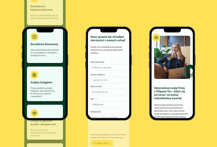
I'd like to share our latest project: a website for the remote accounting firm Oligamy Tax. When designing this site, we focused on two key elements:
Contrast Colors: We used bold, contrasting colors to make the site not only visually appealing but also easy to navigate. Contrasting elements help users quickly find the most important information and highlight key sections of the site.
Clear Contact Form: We understood how important it is for Oligamy Tax clients to quickly and effortlessly get in touch. That's why we created a clear and intuitive contact form, allowing potential clients to easily send inquiries and schedule appointments.
Our goal was to create a modern and functional site that not only catches the eye but also meets user needs.
Thanks for checking out my Dribbble profile!
I hope you found some inspiring projects. If you have any questions, ideas to share, or just want to chat about design, feel free to reach out! I'm looking forward to your message. 🌟📩


