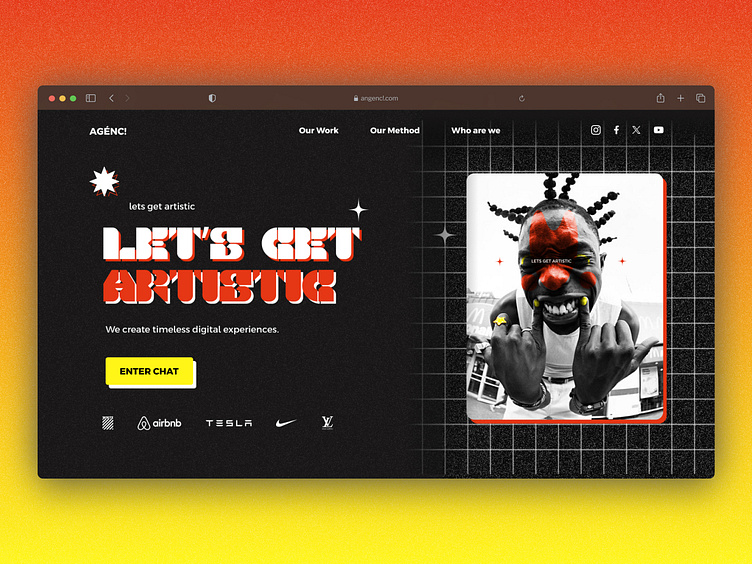
Creative Agency Landing Page Website
The thought process behind it 🧐
✍🏼 The screen should lead the user to the most important actions, easy navigation to other pages and their social media, a call to action for quick contact 📞 and a bit of cool social proof magic.
🎨 Because it's a web agency, the screen should be creative, different and bold.
🪄 The idea of this screen is to spark the user with a sense of creativity and an artistic approach to projects.
More by Pedro Nazário View profile
Like

