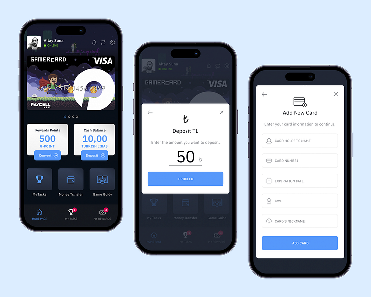
GamerCard: Home Page, Deposit, Add New Card Screens
The example above showcases optimal use of large tap targets and a shift from a white to dark theme color for key actions, demonstrating effective user interface design for critical interactions.
👉 Check out the full case study on my website to see the entire design process and learn more about the project: GamerCard Case Study
🏑 Don't want to leave Dribbble? See GamerCard Project on Dribbble!
🔔 Follow me for more updates and detailed shots from this project coming soon!
🖌️ If you enjoyed this, explore my profile for more of my work and let’s connect!
More by Altay Suna ✦ View profile
Like
