SHARLOT | Logo Presentation


Production and sale of various trucks
• Logo Tasarım ve Görsel Kimlik
• Logo Design & Brand Identity
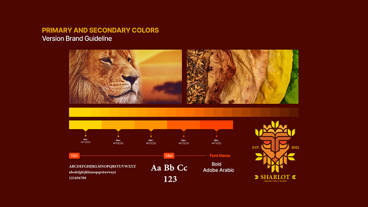
The SHARLOT brand operates in the sale and export of tobacco products. The SHARLOT brand logo is a creative combination of form and color that expresses the brand's identity through shapes and colors. In designing this logo, two main elements, a lion and tobacco leaves, have been used to enhance the relationship between the brand and its customers.
The lion symbolizes power, elegance, and authenticity. Using curved lines and precise proportions with a direct gaze and forward-facing stance, the lion instills a sense of trust and confidence in the target audience.
The colors are aligned with tobacco products. Yellow is cheerful and attractive, grabbing attention. Orange also adds excitement and enthusiasm, encouraging action. Brown creates a sense of attachment to past values and traditions as a symbol of tradition and establishment.
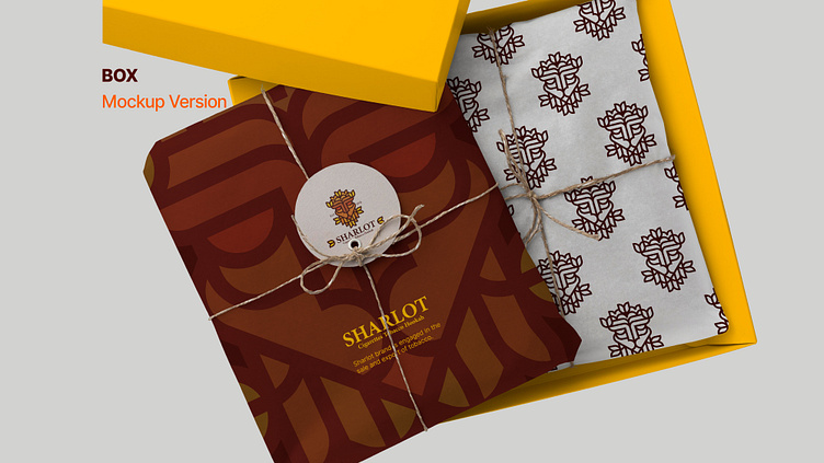
Overall, the SHARLOT logo has a harmonious combination of form and colors, showcasing the brand's values and features. Flexibility in using color and shape, this logo can establish a close and lasting connection with its target audience and stand out prominently in its field of activity.