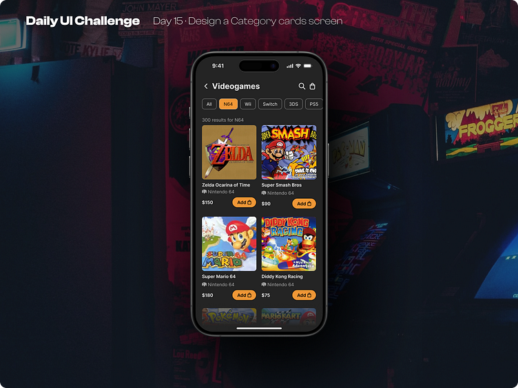
Day 15 of improving my UI skills · #15 Design category cards
Process
For today I needed to design a Category cards Screen. First I chose the topic, measure the size for the cards and start collecting cover images from my fav games. And lastly I made the card structure, created the menu and the tags for the categories.
What I would change
The structure of the card was the most difficult part because I didn't know where to put the CTA button, but finally I put it in the side and I liked it.
I just realize that I could put a fill into the category tags selection, so it would have more contrast with the background
This is a public challenge made by hype4 academy (or SquarePlanet I don't know).
Background image from Unsplash.
Mock-ups from Apple's Figma community files
More by Luis Diego Vindas View profile
Like
