Perch | App Brand
Perch · AI Reading App
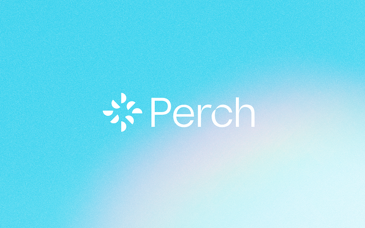
A look at one of the concepts we explored for Perch that didn't make the cut. The logo is meant to be indicative of a the Sunrise/Moonrise that would be associated with migration patterns of birds, with a subtle 'P' shape in the forms. The 'r' in the logotype was trying to hint at the beak of a bird.
Love how this one came together, but ultimately client went with another direction.
Interested in working with us? → lunour.com
More by Wesley Marc Bancroft View profile
Services by Wesley Marc Bancroft
Like


