Travel and Destination App - Settings Page
Travel and Destination App - Settings Page
Presentation and interactive prototype here:
Project Overview
I designed a settings page for a travel and destination mobile app, focusing on creating an intuitive, user-friendly, and efficient experience. My objective was to simplify navigation, enabling users to manage their preferences and account settings effortlessly.
Benchmark Investigation
To ensure my design adhered to industry best practices, I conducted a thorough benchmark analysis of settings pages in leading travel apps such as Booking, Airbnb, and Expedia. During this research, I identified several common practices that influenced my design decisions:
Clear Organization: These apps group settings into logical sections, with the user’s Profile often positioned at the top for quick access, which I adapted to prioritize essential user information.
Easy Navigation: Consistent navigation patterns, such as tabs or sidebars, make it simple for users to move between different sections. I incorporated this approach by ensuring my design allowed seamless movement between various categories within the settings page.
Visual Aids: Icons are frequently used alongside text labels to help users quickly identify different settings, with critical settings like security being more prominent. I used clear and intuitive iconography in my design to enhance usability.
Accessibility: Recognizing the importance of accessibility, these apps support dark mode and offer adjustable text sizes, ensuring that the settings remain readable and user-friendly in various conditions. I ensured my design included dark mode compatibility and maintained a high contrast ratio for improved readability.
Security and Privacy: Leading apps emphasize security by offering features like two-factor authentication and making privacy settings easy to access. I integrated similar security options into my design, ensuring users could easily enhance their account security and manage their privacy settings.
Support and Feedback: A dedicated section for Help, Feedback, and Legal documents is commonly provided, ensuring users have easy access to support and necessary legal information. I included these elements in my design to enhance user support and transparency.
Payment Management: Payment settings in these apps are straightforward, with options to easily manage payment methods and view transaction history, often secured by additional verification steps. I implemented a similar structure to ensure users could manage their payment information securely and effortlessly.
Notification Settings: Users in these apps can finely tune their notification preferences, choosing which types of alerts they want to receive and how. I incorporated granular control over notifications in my design, allowing users to customize their experience.
User-Centered Layout Design
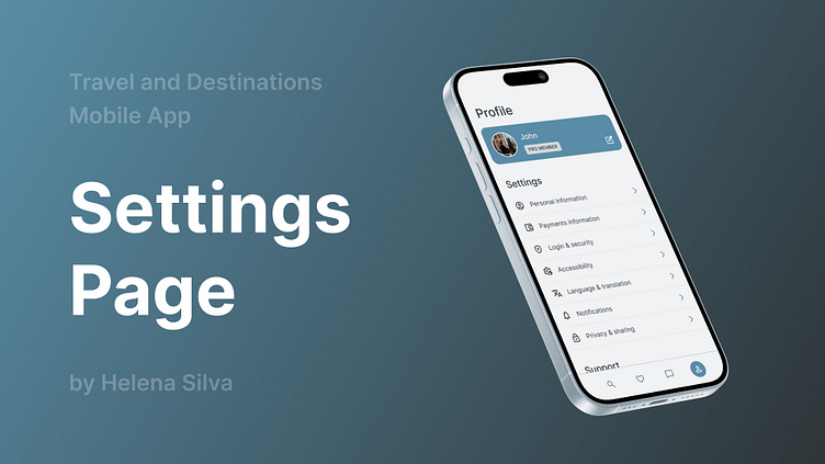
Building on the insights from my research, I developed a user-friendly layout that categorizes the settings page into four distinct sections: Profile, Settings, Support, and Legal.
The Profile section provides a brief overview of the user’s details, which can be quickly accessed and edited.
The Settings section includes essential categories like Personal Information, Payment Information, Login & Security, and Accessibility options.
Support offers quick access to the Help Center, options to Report a Problem, and a Feedback section, ensuring users can easily find assistance when needed.
Lastly, the Legal section houses all necessary legal documentation, presented in a clear and accessible format.
To enhance user control and experience, I specifically designed screens for key areas within the Settings section, including:
Payments Information: This allows users to easily manage their card details and billing information with a secure and straightforward interface.
Login & Security: Providing robust security options, such as password management and two-factor authentication, to safeguard user accounts.
Accessibility: Offering customizable features like text size adjustments and colour contrast settings to ensure the app is usable by all.
Notifications: Enabling users to personalize their notification preferences, ensuring they receive only the alerts that matter to them.
Privacy & Sharing: Giving users control over their data sharing preferences and privacy settings, promoting transparency and trust.
I created detailed prototypes of these key sections to further refine and visualize the structure and layout of the information. This step was crucial in ensuring that each section was not only functional but also aligned with the overall user experience goals of simplicity and intuitiveness.
Dark Mode Compatibility
Given the growing preference for dark mode, I implemented and rigorously tested dark mode compatibility for the settings page.
The focus was on maintaining readability, ensuring proper contrast, and preserving the visual appeal of design elements against a dark background. This ensured that the settings page delivered a consistent and user-friendly experience in both light and dark modes.
This project was instrumental in deepening my understanding of how to balance aesthetic design with functional user experience.
The benchmarking phase underscored the importance of aligning with industry standards while still innovating.
Meanwhile, the prototyping and testing phases highlighted the critical role of iterative design, particularly when optimizing for different display modes like dark mode.
You can explore the full design and interact with the prototype here:
Settings Page for Mobile App by Helena Silva
I hope you like the project and find it as exciting as I do! 😊 🚀


