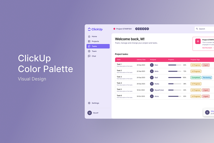
ClickUp - Color Palette
ClickUp - Color Palette
I aimed to create a color scheme that resonates with ClickUp's brand values and principles while ensuring it aligns with industry standards and trends.
To kickstart the project, I conducted some research, analyzing industry leaders like Asana, Monday, and Jira. This benchmark investigation provided valuable insights into accent colors and system colors used for error or warning notifications, guiding the development of ClickUp's color palette.
The resulting color palette reflects the innovative spirit and modern approach. Carefully selected colors stimulate users' visual senses, promoting engagement and active interaction with our tools. These colors embody the values of innovation and efficiency, ensuring a cohesive and impactful visual identity for ClickUp.
I organized my Figma File into:
Research / Benchmark
Principles and Values
Color Palette (including colour contrast testing)
Design (featuring two versions of the explorer bar)
Presentation (with brief explanations of my work)
Hope you like it! 😊


