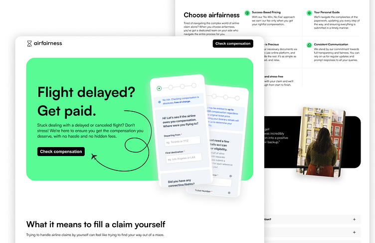
Startup Landing Page | Quick Redesign Series
🚀 Welcome to the Second Episode of the Quick Redesign Series! 🌟
In this series, I'll be exploring various digital products I randomly find online, identifying design nuances, and envisioning how they could be enhanced. It's all about spotting design opportunities and sharing my take on crafting more intuitive and visually appealing user experiences, all within just a few hours.
While I won't be delving into market analysis, user studies, or exhaustive redesigns, I'll focus on crafting a fresh perspective by revamping select screens. It's all about flexing my design muscles and learning in the process. And remember, the goal is never to offend anyone, but rather to celebrate design, have fun, and keep learning along the way! 🚀📱
Your startup landing page is the ideal place for you to promote your digital products and convert visitors into customers.
However, most startup landing pages are 💩
Either they fail to clearly communicate the problem they're solving, or they deliver a poor design and user experience.
Let’s fix that!
I'll show you what to look for when building a landing page and how to fix the most common mistakes.
Thank you for watching!
If you have any thoughts, suggestions, or just want to share your views on the redesigns, feel free to drop a comment below.
If need help with your digital products, visit my website:
My website: https://deblendstudio.com
Follow me on LinkedIn, if you want to learn how to design digital products that make your clients and startup happy:
LinkedIn: https://www.linkedin.com/in/saracudemo/


