Birdie Houses – B lettermark
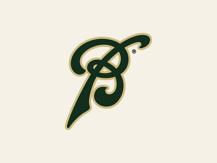
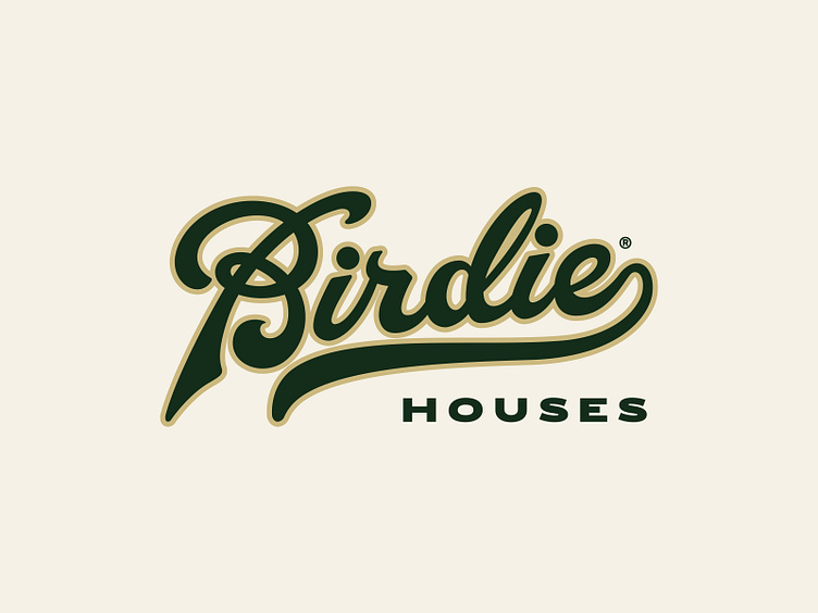
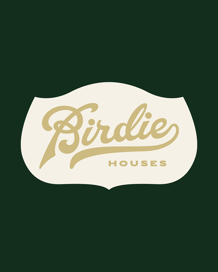
This little fun B mark came from multiple sketches and explorations for my client project Birdie House. We tested many different styles from classic lettering to more simplistic sans serif styles. Although we went a different route this was still one of my favourite approaches I designed.
–
Looking for a design studio? I would love to hear from you.
Email us: alex@aperios-design.co.uk
Let's connect: