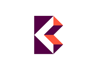
Ben Illustrated Logo
I've been working on my personal mark for my illustration site for quite some time now and finally decided to pull the trigger and launch it.
I wanted to avoid the "BS" monogram. I needed something simpler and something that wasn't associated with...well...bs. The letter B was exhausted in my sketchbook and on my artboard and this is where I landed.
The mark was created on a 3x4 grid made of diagonally cut squares resulting in triangles (see attached sketch). I was able to capture a reflection of my work and my name with as few points and shapes as possible while still looking fresh and visually compelling.
*Updated my illustration site with the new logo and a few pieces from 2015. 2 more coming in January. Stay tuned!
More by Ben Stafford View profile
Like

