Metro App Re-Design
**Hey Dribbblers!**
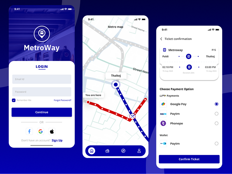
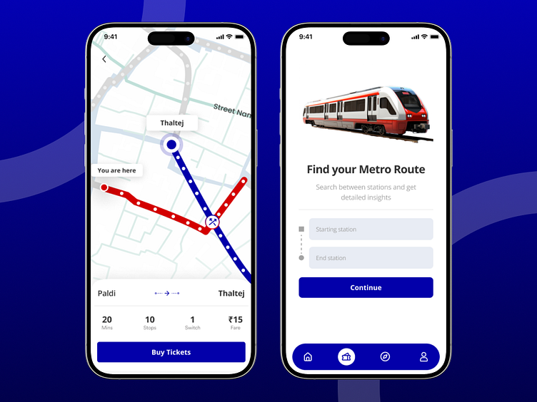
Today, I'm thrilled to share a sneak peek of my metro app redesign concept, aimed at streamlining the daily commute for busy urbanites. This design prioritizes two key user needs: real-time train information and seamless ticket booking.
**Taking Control of Your Journey**
The hero of the app is the home screen, featuring a clean and uncluttered layout. At the top, a prominent search bar allows users to quickly find their desired route. Below, a dynamic tile displays the live status of the next train to their frequent destination.
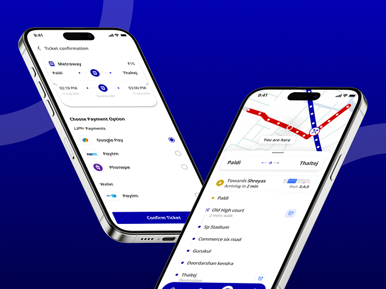
This tile showcases key information like:
Train Line: Clearly identified with its corresponding color.
Wait Time: Updated in real-time to avoid last-minute scrambles.
Destination: Provides a quick glance at the end point.
**Feedback Appreciated**
I'd love to hear your thoughts on this concept. What features would you find most helpful in a metro app? Feel free to leave your comments below!
#metroapp #redesign #publictransport #uiux #userexperience #dribbble
P.S. Stay tuned for further iterations exploring additional functionalities like accessibility features and in-app navigation.
