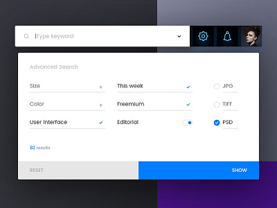
Shot 082 - Advanced Search
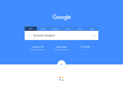
Today's challenge was an Advanced Search form, but I decided to deviate a little and redesign the advanced search functions that Google currently use in their search and redesign the whole page a little. I kinda miss the flat blue and wanted to explore use of bold colour to denote different properties of the brand, so maybe it changes depending on what you're looking for.
I also know they invested in animating these colourful dots for different processing actions, so I had a few versions where that extended into the rest of the design, but in the end I kept it simple and stuck to a familiar material design feel. There's also a FAB for adding more filters if necessary. Think this one turned out alright.
@2x. Thoughts welcome.
EDIT: Should have totally removed the icons from the search bar. Nevermind I guess, just imagine them without!

