My first STYLE TILE!
Lil' Dancers is a brand which was used as an example by the UI/UX course I took to show us the complete flow of how to design for a particular brand.
Once you are done with the user research, knowing all the personas and what the brand requires, we get it all together and start thinking about the UI accordingly. All the UI components including typography, color, images, icons, etc are all to be thought about before building the complete branding.
In order to make this all deliverable and get the client on board using a 'Style Tile' is very helpful and important. A Style Tile builds a direct connection with actual interface elements without defining the layout. It is a way to showcase our ideas to our clients and get their opinion on the same.
So, I made my own style tile of Lil' Dancers by incorporating all the learnings from the course.
Branding
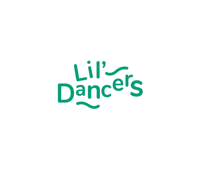
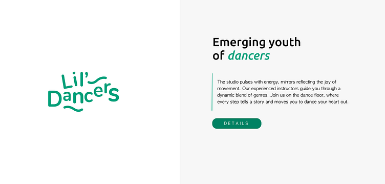
The Lil' Dancers logo and description was already provided by the brand. I decided to enlighten the main brand green color by using its button and writing 'dancer' in it.
Typography
I decided to use the sans serif font 'Ubuntu' as the heading font seemed very informal to me. As it is a kids dance class, I didn't want the font to be formal but instead wanted it to have a fun touch. The Ubuntu font has a lot of curves without specific sharp edges and hence I thought it would be perfect for this.
For the paragraphs, I decided to use the font 'Apple Gothic' as it is a very circular font and it goes with the curvy lines which are part of the brand logo.
Colors
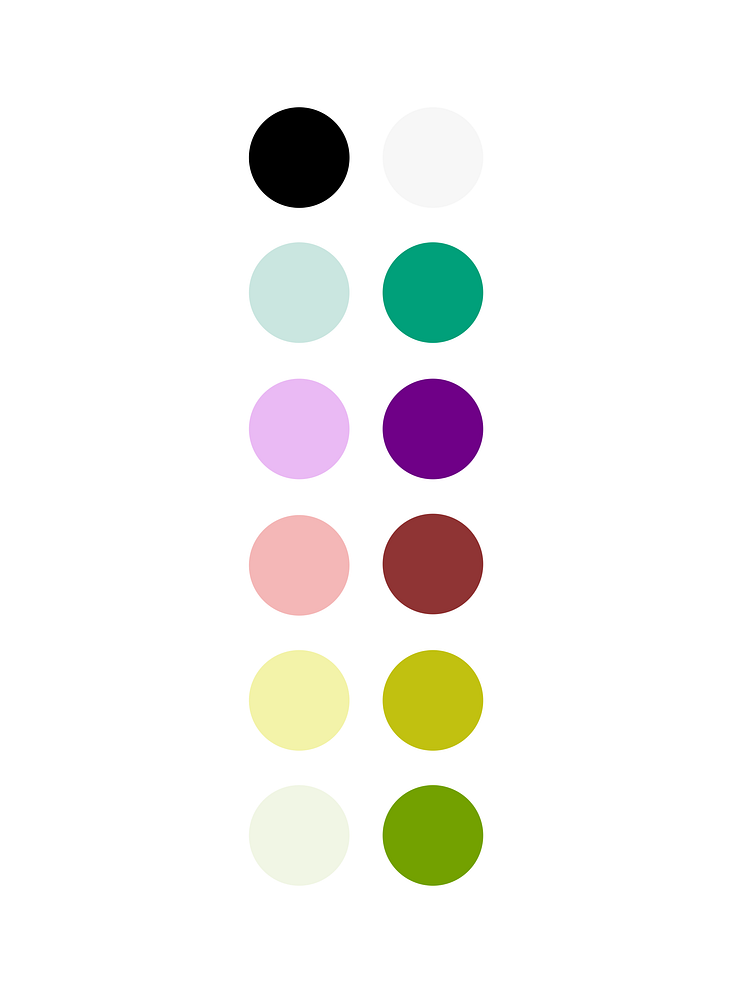
Studying the personas and knowing the main audience are parents with kids with ages less than 18 and hence the colors should be bright, appealing and decorative. Hence, I took a variety of colors along with their lighter neutral shades.

Buttons & Iconography
Defined the buttons using the main green brand color. I made circular edged buttons to go with the curvy theme of the brand used.
The arrow, cross and search icons were made using vectors which can be used further for making the website interactive.
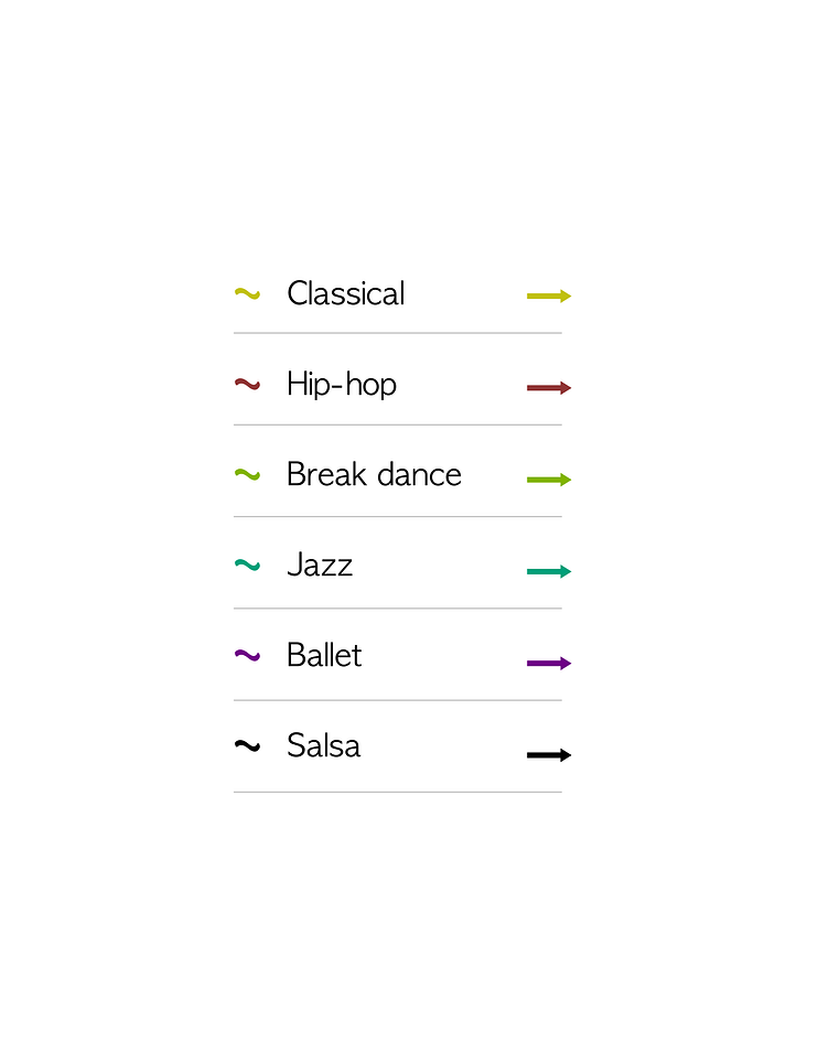
I made this index for the brand as Lil' Dancers allows the kids to explore thorugh different forms of dance. I wanted to give a unique color to each dance form making it easy for parents to differentiate between them. I used the curvy lines as bullets similar to the ones in the logo to make it merge with the brand.
Form
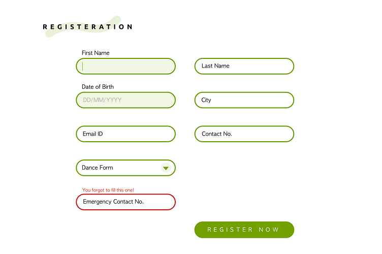
I designed a registration form for the kids enrolling for these dance classes. I made use of the light shade of green and a bright red for a warning. In the registration heading, I made use of the curvy line again to make it part of the brand.
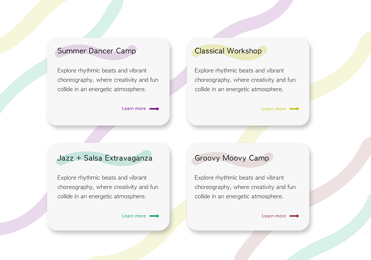
Here is a part of the branding I thought I could make a little fun and eye-catching to show the upcoming and exciting camps for the kids. The curvy lines background was made to enhance the brand and give a simple yet impactful image.
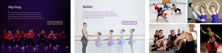
Images
Here are few of the images which I thought would be very appealing to the parents of the kids and would make them want to enroll their kids to this organisation.
