Brand Identity for Banu Fried Chicken
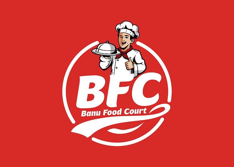
Banu Fried Chicken (BFC) is a culinary haven where the art of fried chicken meets a world of flavors. Specializing in perfectly crispy and juicy fried chicken, BFC also embraces a diverse range of multi-cuisine dishes, ensuring a delightful experience for every palate.
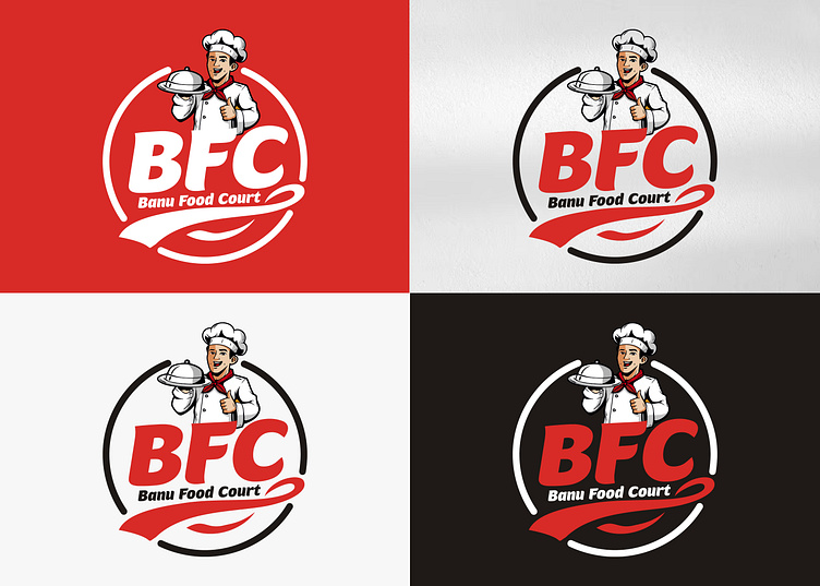
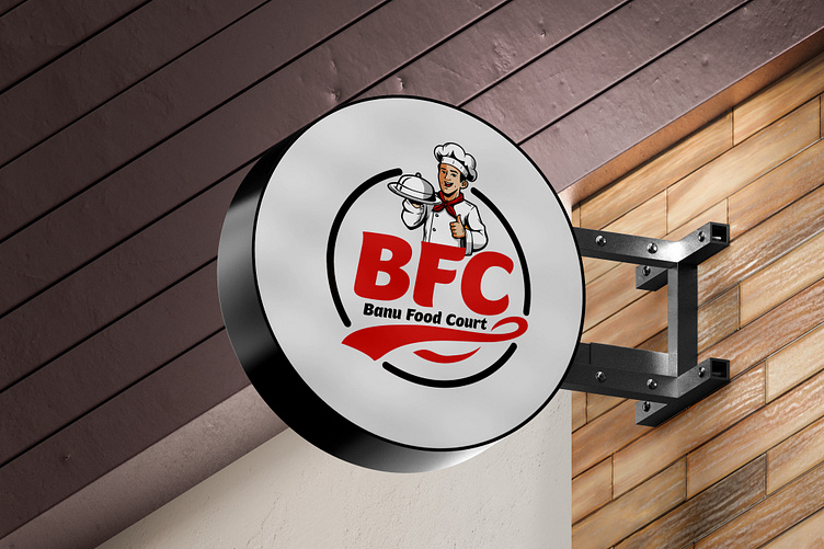
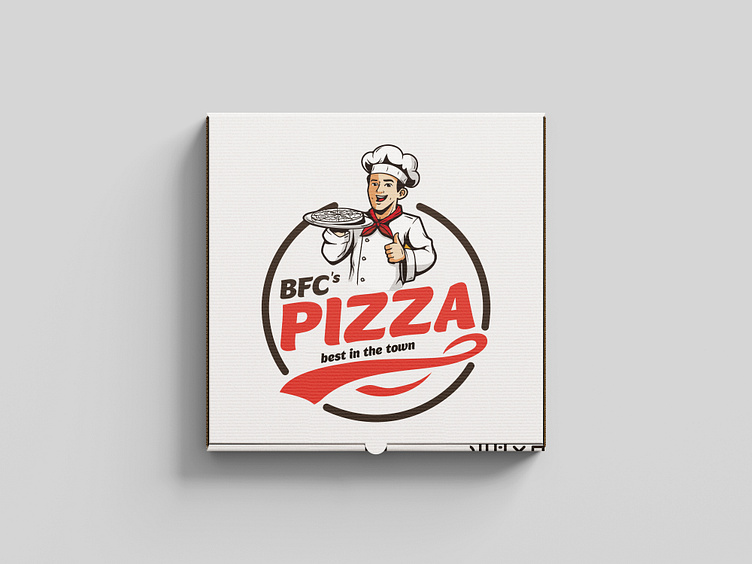
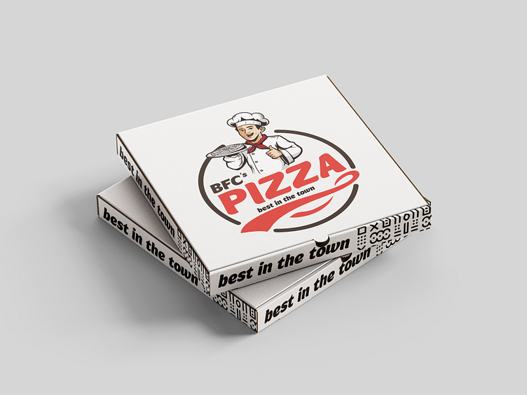
The BFC logo variations are designed to be versatile and adaptable to various contexts while maintaining a consistent brand identity. The use of different color schemes allows the logo to be effective across multiple platforms and media, ensuring that BFC remains recognizable and memorable to its audience.
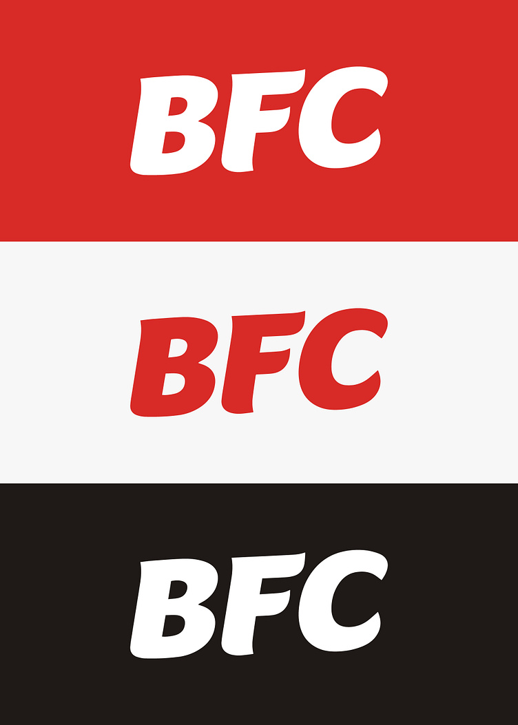
The bold and rounded font used for "BFC" and "Banu Food Court" ensures readability and reinforces the brand’s strong identity.
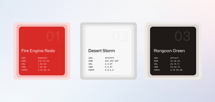
The color palette for Banu Fried Chicken (BFC) has been carefully selected to reflect the brand's vibrant and dynamic identity. Each color significantly conveys the brand’s values and enhances its visual appeal across various mediums.
Thank you for exploring the brand identity project for Banu Fried Chicken (BFC). This journey has been a celebration of creativity, passion, and dedication to crafting a brand that stands out and resonates with its audience. From the vibrant logo to the carefully chosen color palette, every element has been thoughtfully designed to reflect the essence of BFC—bringing together the best of multi-cuisine delights with an undeniable love for fried chicken.
I hope this project has given you a glimpse into the level of detail and commitment I bring to every design endeavor. If you want to elevate your brand with captivating visuals and a cohesive identity, I would be delighted to discuss how we can bring your vision to life.
Feel free to contact me for any of your design needs. Let's create something extraordinary together.
