RAKHSH KHODRO DIESEL | Logo Presentation


Production and sale of various trucks
• Logo Tasarım ve Görsel Kimlik
• Logo Design & Brand Identity
KHODRO DIESEL produces and sells various trucks. The logo uses two elements, a circle and a horse. The circle in the logo represents economic activity, production, and commerce, creating trust and intimacy in the target audience. The horse symbolizes unity, movement, and progress. The horse element in the logo is designed without sharp angles to create visual harmony and a sense of intimacy."Rakhsh" means a purebred horse, evokes a sense of authenticity and a connection with the brand's history.
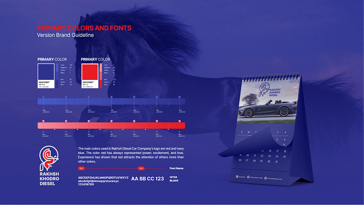
The choice of colors plays a significant role in a brand's success. In the RAKHSH KHODRO DIESEL logo, the blue color creates a sense of trust and security. The blue with a long wavelength is visible from a distance. The red color in the logo creates energy, intensity, and attractiveness, drawing attention to the logo. The combination of red and blue colors in the logo design creates a sense of intimacy and recognition while portraying seriousness and power in the field of work. These two colors emphasize trust and energy, two aspects of the brand.
In summary, the RAKHSH KHODRO DIESEL logo represents the brand's identity, goals, and values, establishing a good connection with the customer. This logo can positively impact the target audience's mind, gaining customer trust.