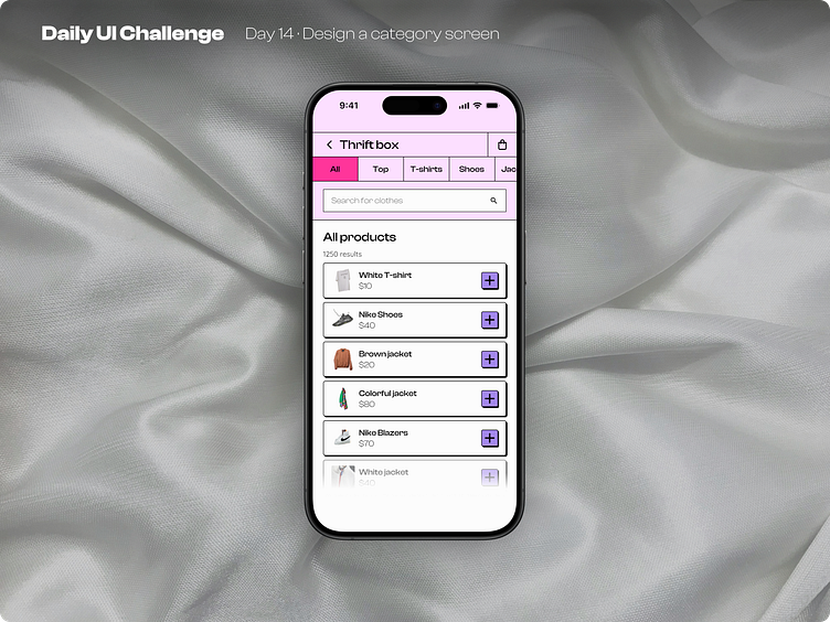
Day 14 of improving my UI skills· #14 Design a category screen
Process
For day 14 I had to design a category screen. I started by choosing the topic, then made all the copy and selected the images, remove the background. Finally I put everything together with the structure, applied brutalism and chose a background image.
What I would change
I liked a lot todays design I feel like the style that I made for the menu came along pretty good and I liked using the shadows for the buttons again.
This is a public challenge made by hype4 academy (or SquarePlanet I don't know).
Images from Unsplash.
Mock-ups from Apple's Figma community files
More by Luis Diego Vindas View profile
Like
