Teamcamp's Navbar
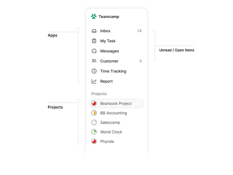
At Teamcamp, we strive to enhance user experience and streamline project management. Today, we're excited to introduce our newly designed navbar, meticulously crafted to make navigation smoother and more intuitive. Let's dive into the story behind its three main components:
Current Workspace: Your workspace is the hub of your projects, and we wanted to ensure it's always at your fingertips. The current workspace section of our navbar allows you to switch between different workspaces seamlessly, keeping your focus where it needs to be.
Apps with Notification Count: Never miss an important update! Our apps section now includes a notification count, so you can easily see what's new. You're always in the loop, whether it's a new task, message, or file.
Favorite Projects: Quick access to your most critical projects is essential for productivity. We've introduced a favorites section, allowing you to pin your top projects for instant access. No more scrolling through lists – your key projects are just a click away.This redesign is a direct result of your feedback.
We're committed to making Teamcamp a tool and a partner in your success. These changes will significantly improve your workflow and project management experience.Check out the new navbar in action, and let us know what you think! Your insights and feedback continue to drive our innovation.
Haven't tried Teamcamp yet? Try it for free www.teamcamp.app
