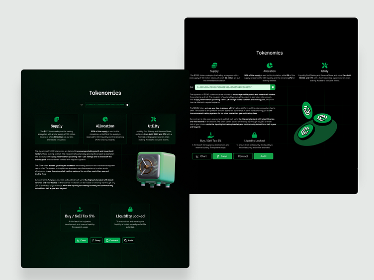
Crypto Website Design
Users want their content to be more scannable.
And as designders it’s our job to make it so. So next time you feel like there’s too much “unused space” on your website, there really might be a reason for it.
Here is a before and after of another section from a website I redesigned.
You can see that on the left one, there are points of interest segmented and drawing the eye, whereas on the right, you can easily get lost and tired of reading.
This is a personal redesign I do not own the original.
Hi,
Thank you for clicking on my work.
I appreciate all the feedback and I'll try my best to be to the best!
For contact use:
More by Andrej View profile
Like
