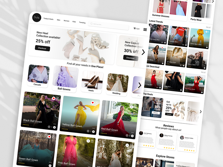
E-commerce Fashion Website (Style Homepa) UI UX Design
Homepage Focus: Frictionless Navigation & Personalized Discovery
Hero Section:
Clean, minimalist layout to avoid overwhelming users.
Large, high-quality hero image or video showcasing a captivating style or product.
Microinteraction: Hovering over the image reveals subtle stylistic variations (color palettes, accessories) to pique user interest.
Subtle animations: CTA buttons like "Shop the Look" or "Discover Your Style" have smooth animations for a polished feel.
Product Cards:
Clean and visually appealing design with high-quality product images and clear, concise information (name, brand, price).
Hover effect: Reveals additional details like product rating, size availability, and quick-add to cart option.
Overall UI/UX Philosophy:
Intuitive navigation: Users can easily find what they're looking for without getting lost.
Clean and uncluttered interface: Focus on product visuals and clear calls to action.
Personalized experience: Leverage data to suggest relevant products and create a sense of discovery.
Microinteractions and subtle animations: Enhance user experience and brand perception.
